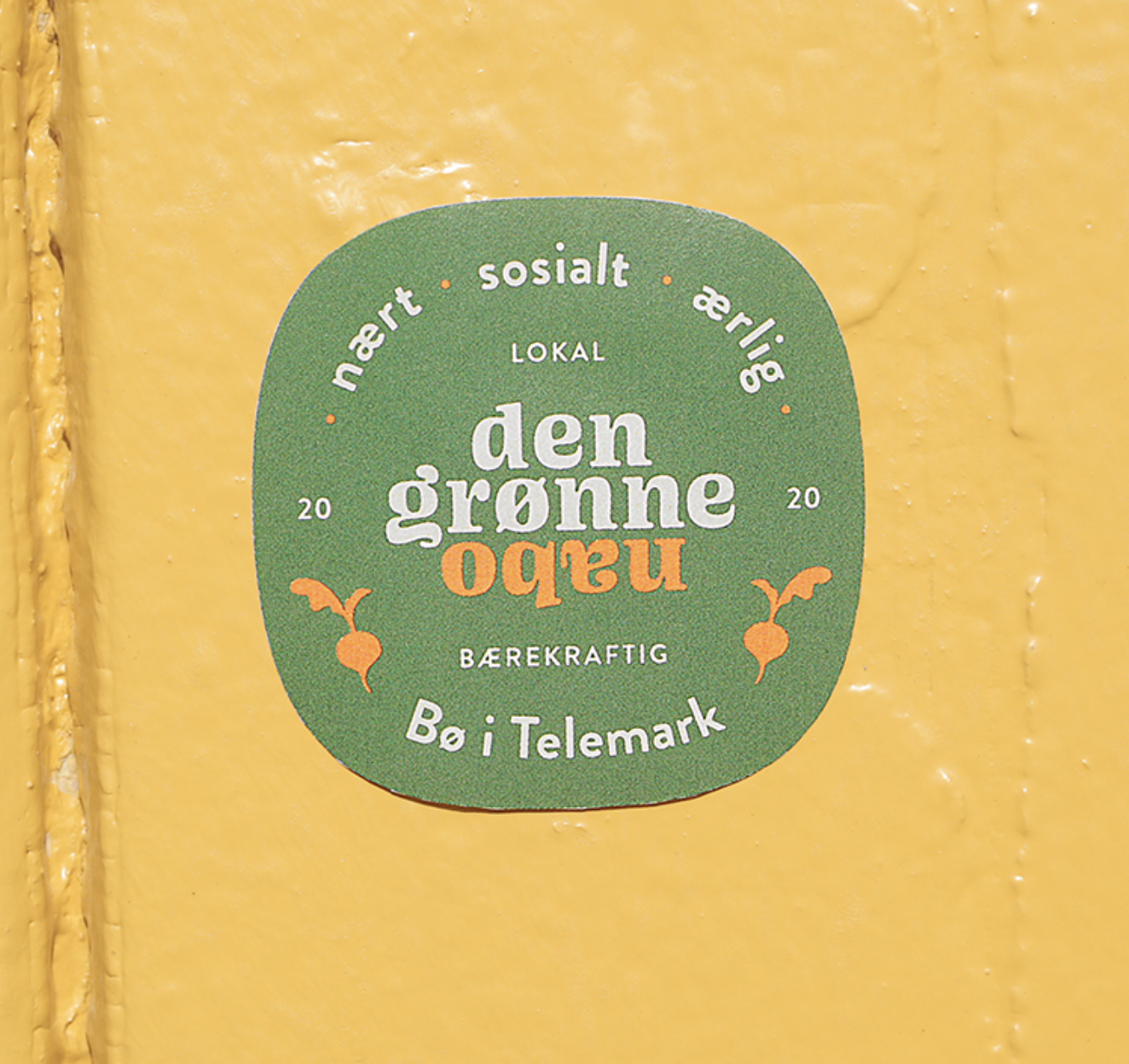
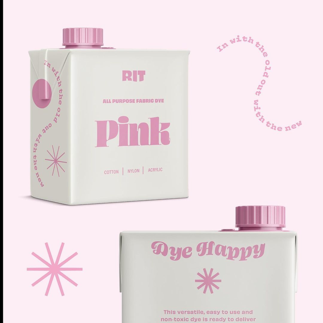
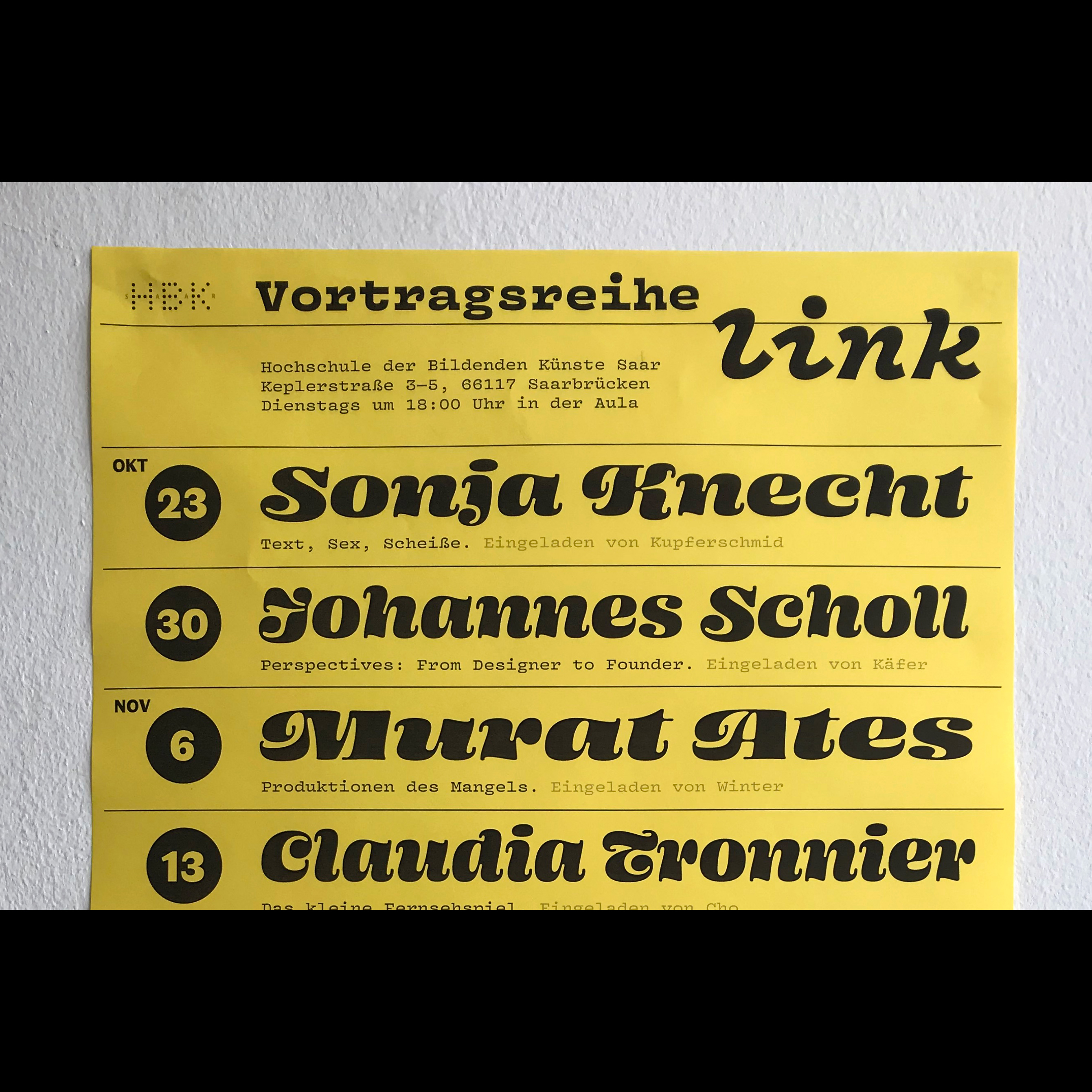
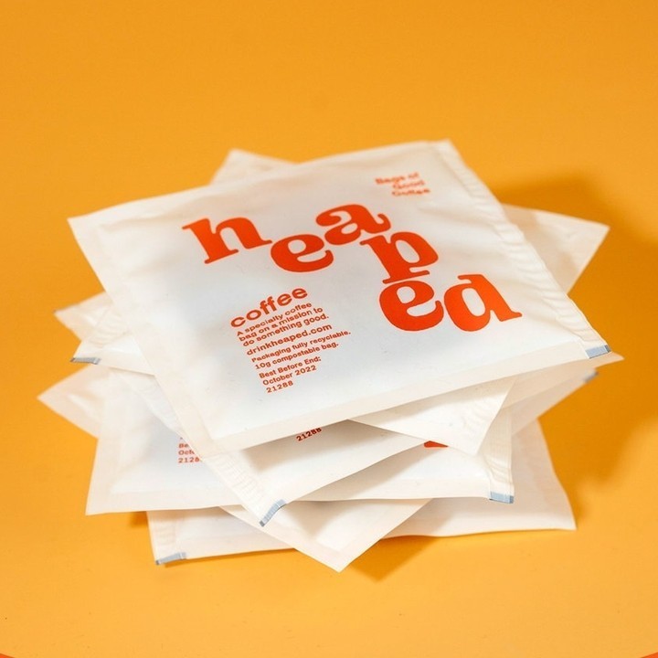
Ohno Blazeface is a “real” fat fatty of a display serif. Taking a look at the (fatface) genre, I was seeing mostly the same things [over and over]: №1 an inability to treat problematic letters effectively, & №2 a consistently traditional structure. ¶ I was convinced a fatface could be more chill, and so Ohno Blazeface was born. ✌
Ohno Blazeface Italic is a “companion” but is also doing its own thing. Italic fatfaces often sport lovely entry and exit strokes that give words a jolly roundness. These features are exaggerated in Ohno Blazeface Italic, with each hairline terminating in a subtle teardrop shape. Typically, the f, x, and z present some extra whitespace. Since that’s a big no-no in this design, unusual forms were chosen for maximum positive space.
→NINE←
OPTICAL
SIZES PROVIDE
PLENTY OF OPTIONS
FOR CONSIDERED TYPESETTING
ACROSS A RANGE OF APPLICATIONS AND
MEDIA. USE THE LARGE SIZES FOR BOLD EDITORIAL WORK.
AND THE SMALLER SIZES FOR STUFF THAT PEOPLE PROBABLY WON’T READ.
TIP: NO ONE REALLY READS ANYTHING. EXCEPT THIS. RIGHT NOW. ARE YOU STILL HERE?
Oh good, that reminds of something else I was going to mention. I almost forgot!
The whole reason for Ohno Blazeface was to be incredibly bold.
So bold, that you would be hard pressed to find
Large pockets of whitespace in words at all.
It can be tricky to build letters with
that objective, but here we are.
Actually, I admit
It was self-
indulgent.


