SWEAR
6 weights, 4 optical sizes, 2 italics. a total of 72 styles. familiar flagrancy for your agency.
—————————————————————————————————————————————————————————————
First, the “Romans”
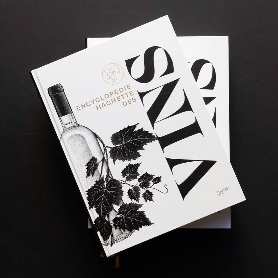
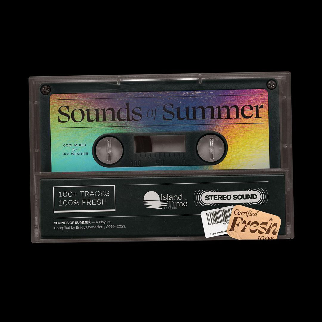
The most conventional of the three constructions that comprise Swear, the Romans follow a historic precedent for contrast. What does that mean? It looks pretty normal.
Now, the first set of italics
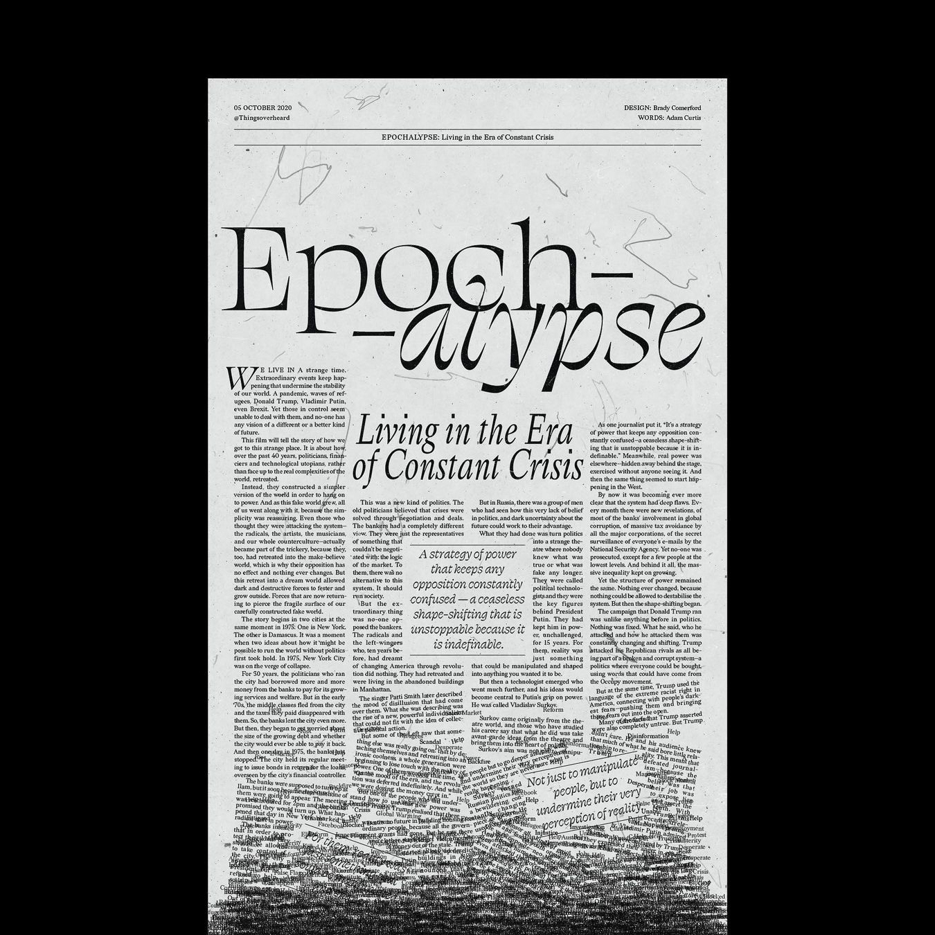
With elongated entry and exit strokes, the display italics have the drama turned up for a consistent texture that reads like a sympathy card.
In the text sizes, the effect is dialed down to make a hard-working family member that creates visible emphasis, without saying, “HEY, LOOK AT ME, I’M ITALIC!”. Clear, without being obnoxious. Maybe it’s an approach I should try more often.
Finally, the reverse italic
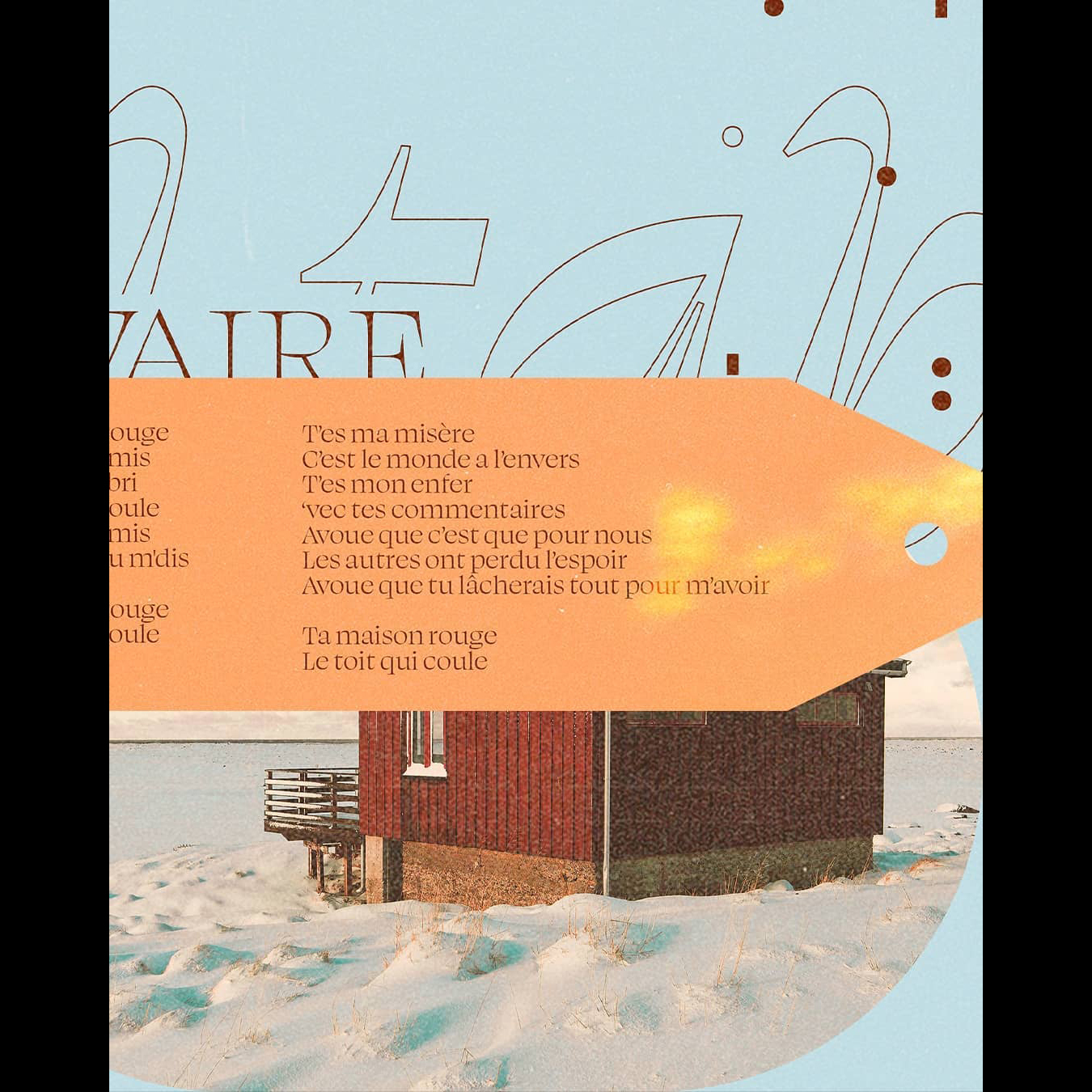
The not-too-cleverly-named “Cilati” styles (italic spelled backwards), offer an unexpected second option for emphasis. The Banner and Display styles are straight up wacky.
But the text styles function more or less like a standard (albeit more expressive) italic. Which italic do you prefer? We like to leave this decision in the capable hands of the design. ¶ Thank you for taking some time to learn about Swear. Now, please enjoy this semi-nonsensical text for a range of specimens that highlight various styles in the family.
—————————————————————————————————————————————————————————————
SPECIMENS
Close the farking door
Drawing a text face is always impossible for me. I came to type design through logotypes and advertising, not through the higher brow path of text fonts and literature. Perhaps this is the reason my attempts to start a small optical size design failed in grad school. It was there I learned the lesson that for me, display comes first, and designs for smaller sizes can be born out of them.
The flat brush is fricking hard!
It wasn't long after I started practicing with the flat brush that I realized I was never going to gain mastery over this tool. Fun as it may be to practice, at the end of the day, I'm a type designer, and not a calligrapher.
This is the definition of a “try hard.”
A distinct feature of Swear came out of sheer necessity. I always appreciate the menacing effects of exaggerated, razor thin serifs, but they also cause a lot of problems. Particularly on letters like A, and V, the exterior serifs can push out neighboring letters to an absurd degree, creating large pockets of whitespace that distract the reader. I usually try to keep the interior serifs large, and the exterior serifs small, but here I pushed it to the extreme.
It wasn't long after I started practicing with the flat brush that I realized I was never going to gain mastery over this tool. Fun as it may be to practice, at the end of the day, I'm a type designer, and not a calligrapher.
Gosh dernit
La técnica aburrida produce resultados mundanos
Ik kreeg te horen dat het in het Italiaans erg ongemakkelijk klinkt. Om eerlijk te zijn, klinkt het ook in het Engels vreemd. Het voelt gerechtvaardigd, omdat het er nog onhandiger uitziet dan het klinkt.
Combien de fois dois-je apprendre que même lorsque les formes ne sont pas folles, j'aime toujours créer du texte?
Siempre me ha gustado decir palabrotas. Usar malas palabras intencionalmente puede aportar un poco de ligereza y humanidad a un momento, o hacer que la gente se sienta cómoda. A veces, sin embargo, escapan en momentos de frustración y hacen que la gente se sienta incómoda. Quizás este tipo de letra pueda hacer lo mismo.
—————————————————————————————————————————————————————————————
FEATURES


