OH no Type Company.

Hobeaux Black

Dang

Hobeaux Light

The original Hobo was an art-nouveau influenced design released in 1910. Over the years, this one-of-a-kind and often maligned typeface slowly degraded with each transition in type technology. In the 1980s, Hobo was one of the first typefaces digitized due mostly to its unique aesthetic and malleable voice. Unfortunately, the care taken in tracing the design left much to be desired, if only because type designers hadn't yet figured out how to best draw curves. Hobo was in desperate need of some attention, but unfortunately got installed on millions of desktop computers as it was.

Hobeaux Black

The typeface nobody was

asking for just got WAY better!

Hobeaux Light

Hobeaux is a modern revival—an attempt to fix the mistakes, and maintain all the glory that made Hobo the powerhouse it was. Each character was redrawn and spaced from scratch. Additionally, descending letters have been provided as stylistic alternates for those seeking a more traditional construction. With five weights and several features for the designer seeking a high performance type family, Hobeaux is a ready and willing addition to any typographic palette.

Hobeaux Light

- - - - - - - - - - - - - - - - FIVE WEIGHTS - - - - - - - - - - - - - - - -

Hobeaux Light

Launderettes

Hobeaux Regular

Foreplanning

Medium

Decerebrised

Hobeaux Bold

Unattainable

Hobeaux Black

Whitleathers

Hobeaux Light

* * * * * * * * * * * * * * * * * * * * *

Hobeaux Black

EVERYTHING LOOKS

BETTER IN HOBEAUX!

Hobeaux In Use
Hobeaux 8
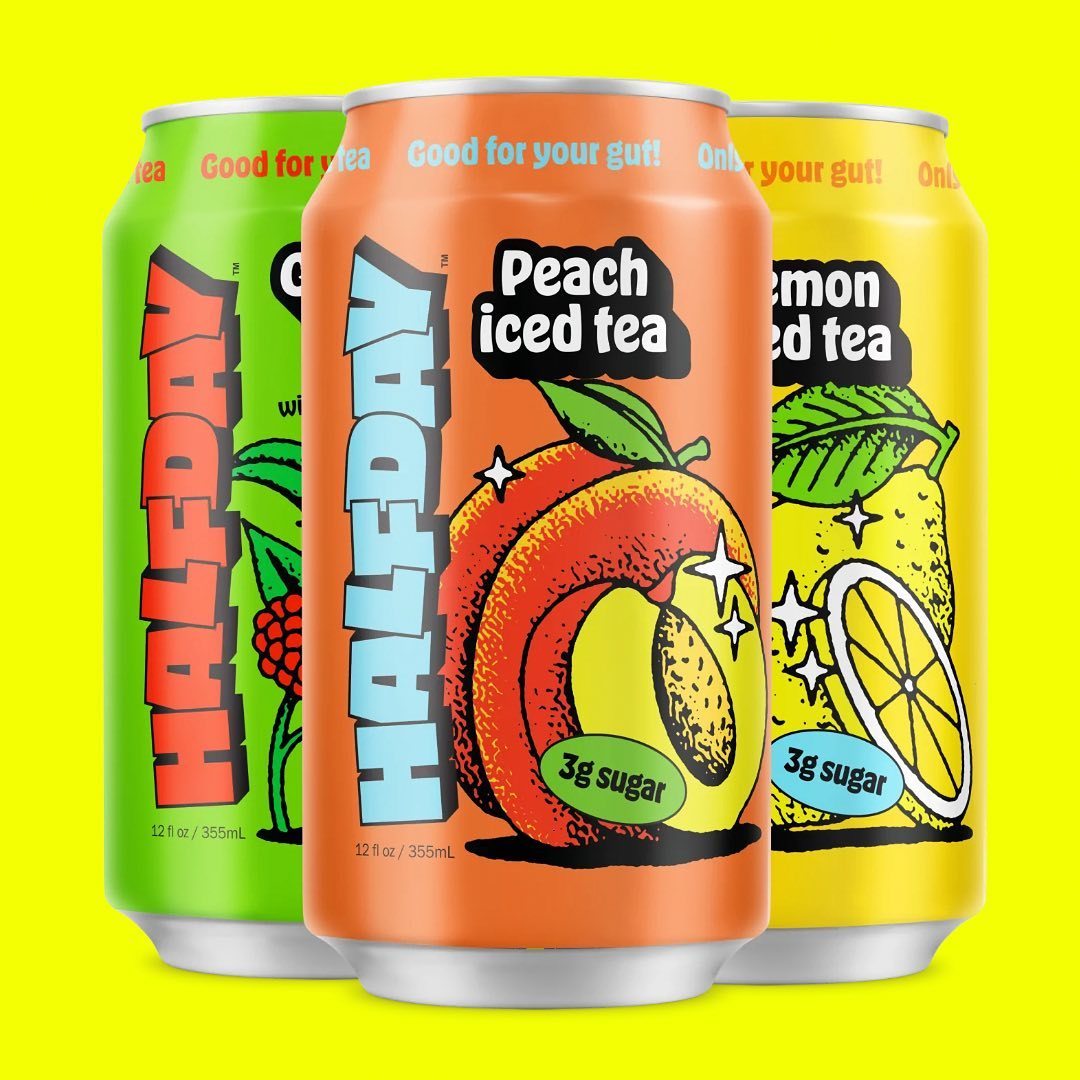
Halfday Iced Tea Packaging
Hobeaux 6
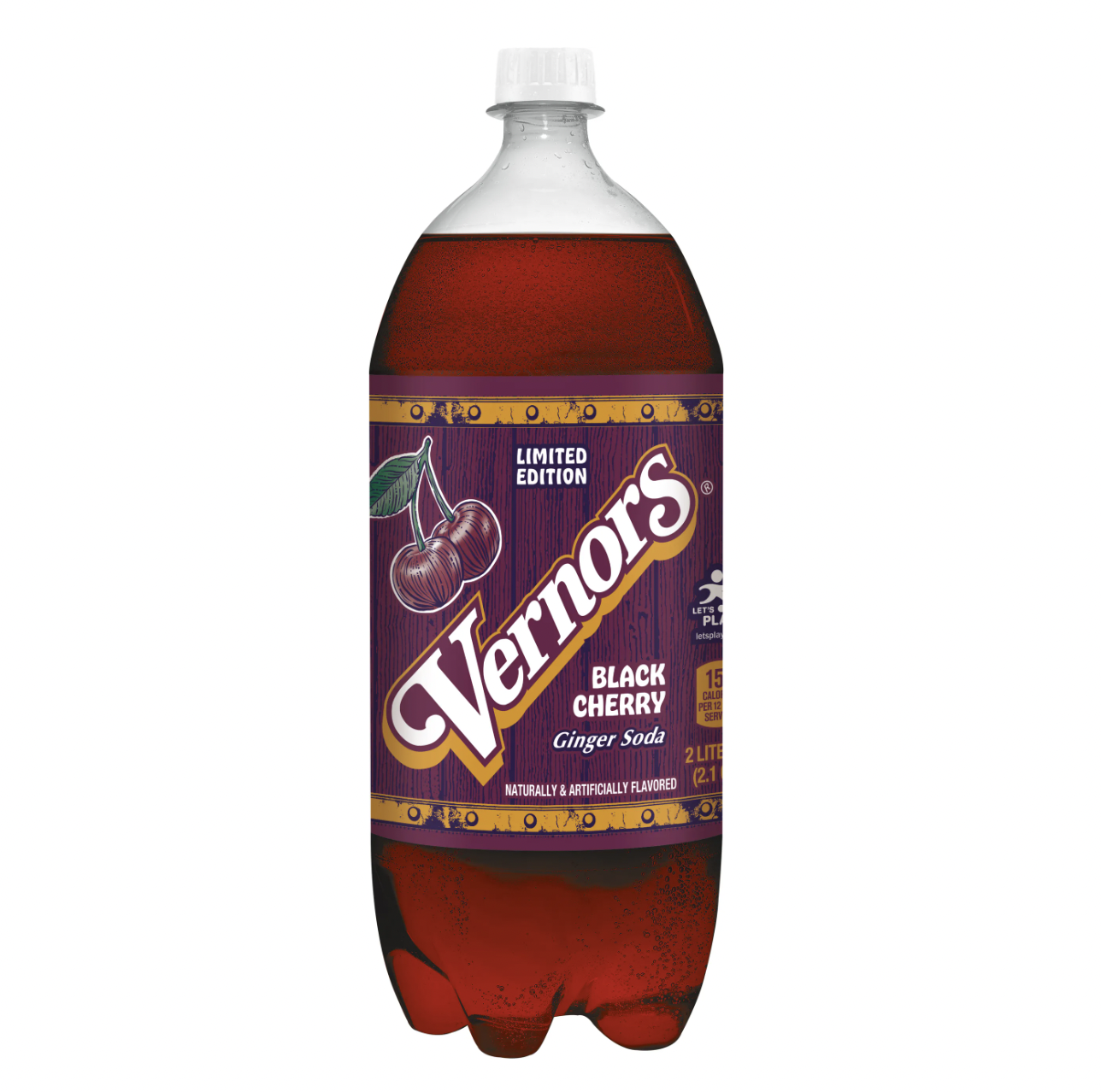
Vernors Black Cherry Soda
Hobeaux 3
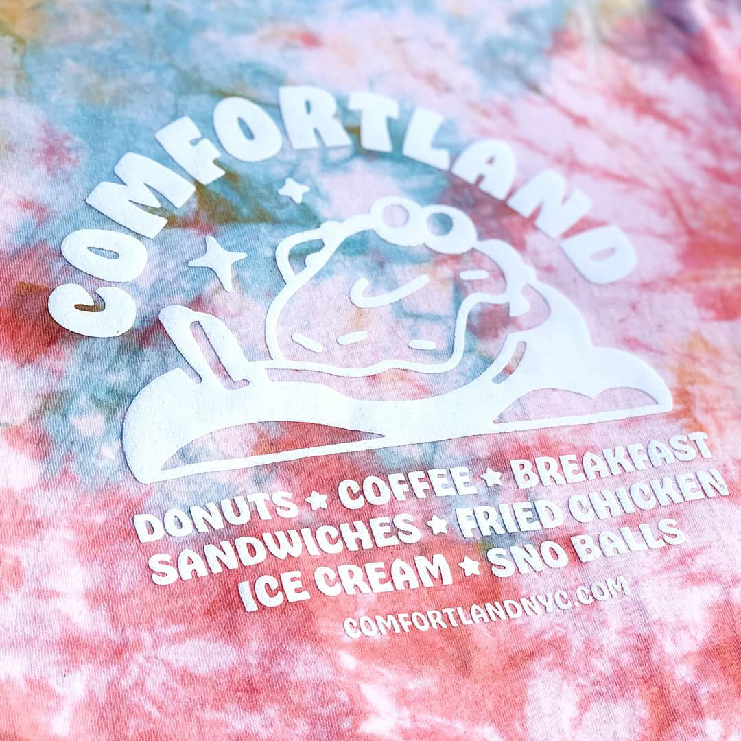
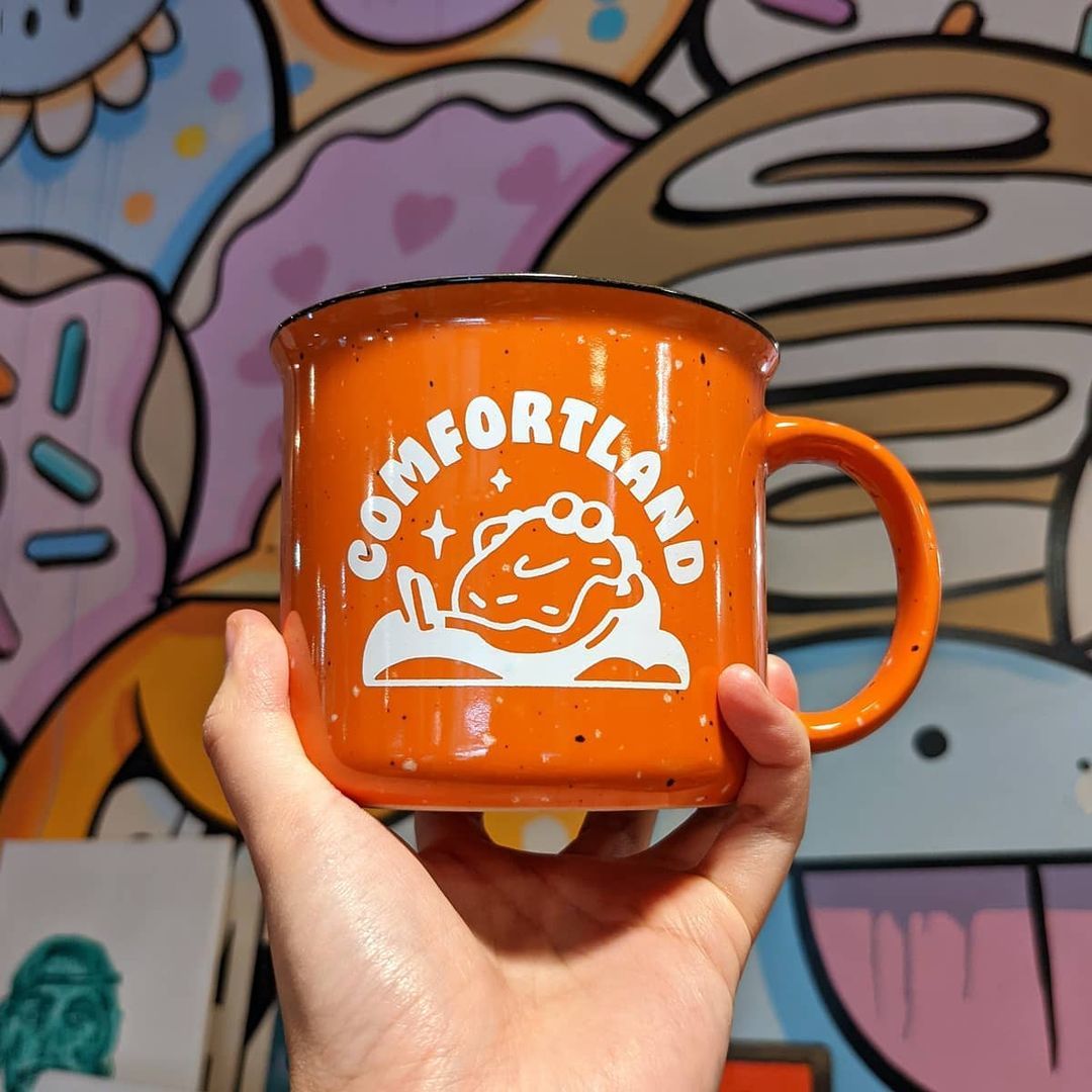
Comfortland Merch
Hobeaux 1
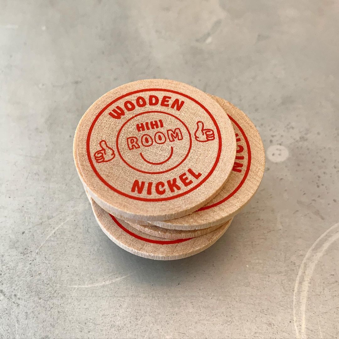
Branding for the HiHi Room
Hobeaux 4
Comfortland Mug Graphics
Hobeaux 5
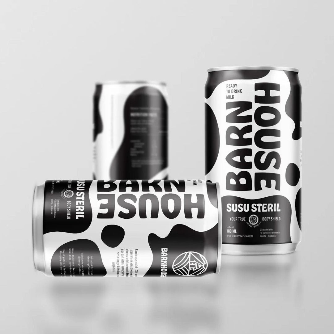
Barnhouse Dairy Packaging
Hobeaux 2
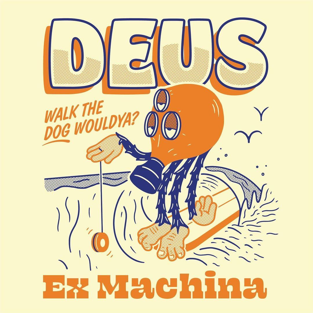
Deus Illustration
Hobeaux 7
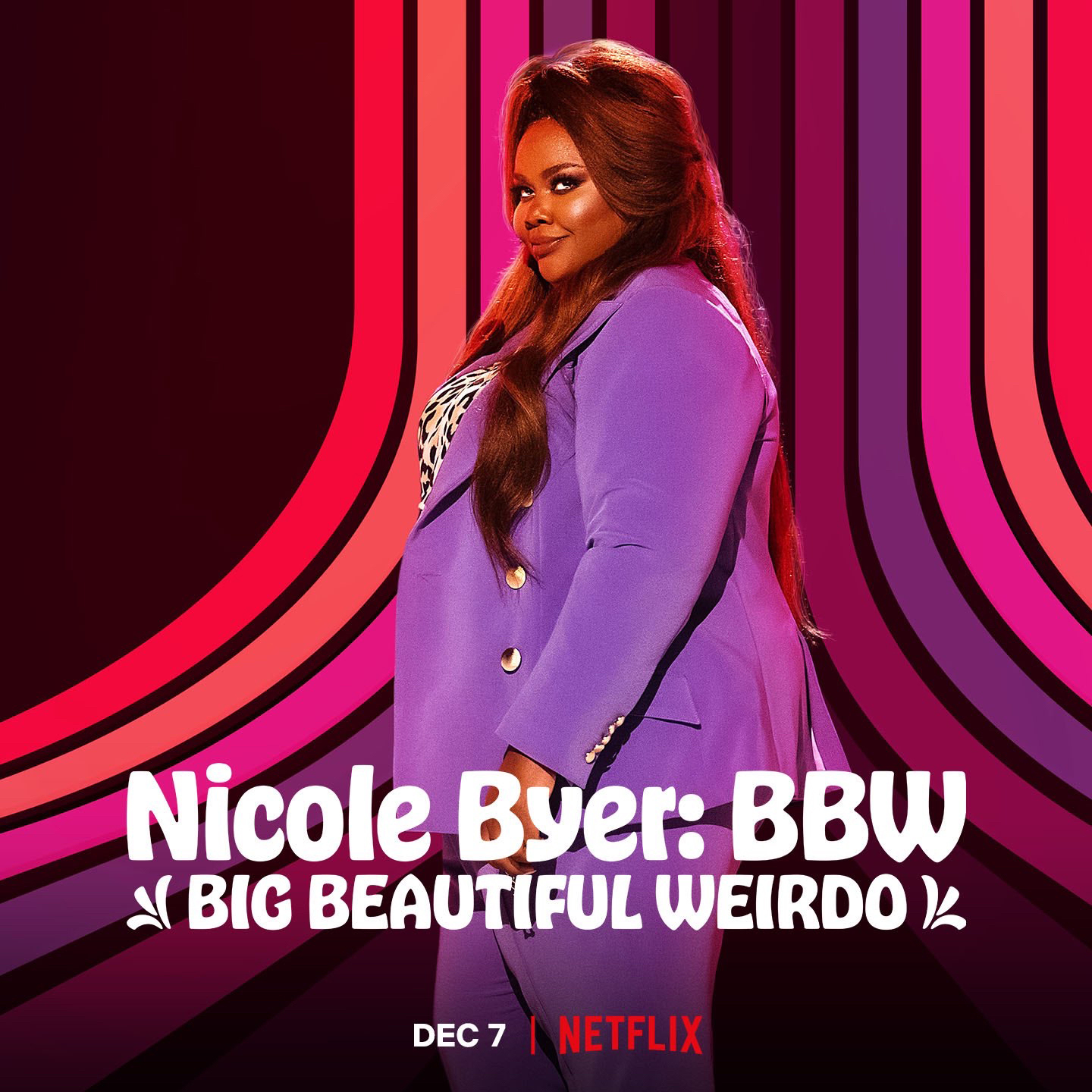
Titling for Nicole Byer's Stand up Comedy
Alternate Ampersand
Alternate ampersand.
Arrows
Arrows are much more useful than most letters.
Artboard 12
Some of the more obscure characters that weren’t even drawn for the original Hobo.
Bursts
Bursts are ready for prices. FYI this typeface is much more expensive than 15¢.
Crossbar Shaver
A subtle improvement to spacing can be found in the crossbar shaver. Automatically applied.
Descending Alternates
Descending alternates are provided, although they are not recommended.
Drop Shadows
I once put my real phone number on a type specimen, and someone calls it about one time every year.
Figures
The three flavors of figures. Cap height, slightly smaller, and the exotic non-descending figures.
O Flipper
The O flipper is automatically applied, and saves two sheets of paper every five years. Basically Ecofont.
Ornaments
Ornaments ready to spice up any marquee. Fun fact: Hobo is truly in use on the Wiltern and the Pantages.
Works Well With Outlines
Just when it can’t get any better, check this thing out with outlines! Incredible.

Buy

The Complete Family

Individual Styles

Licensing Options

Covik Sans Bold
Covik Sans Regular Italic
Ohno Blazeface 18 Point
Covik Sans Bold Italic
Covik Sans Regular
Vulf Mono Light Italic
Vulf Mono Light
Vulf Mono Bold Italic