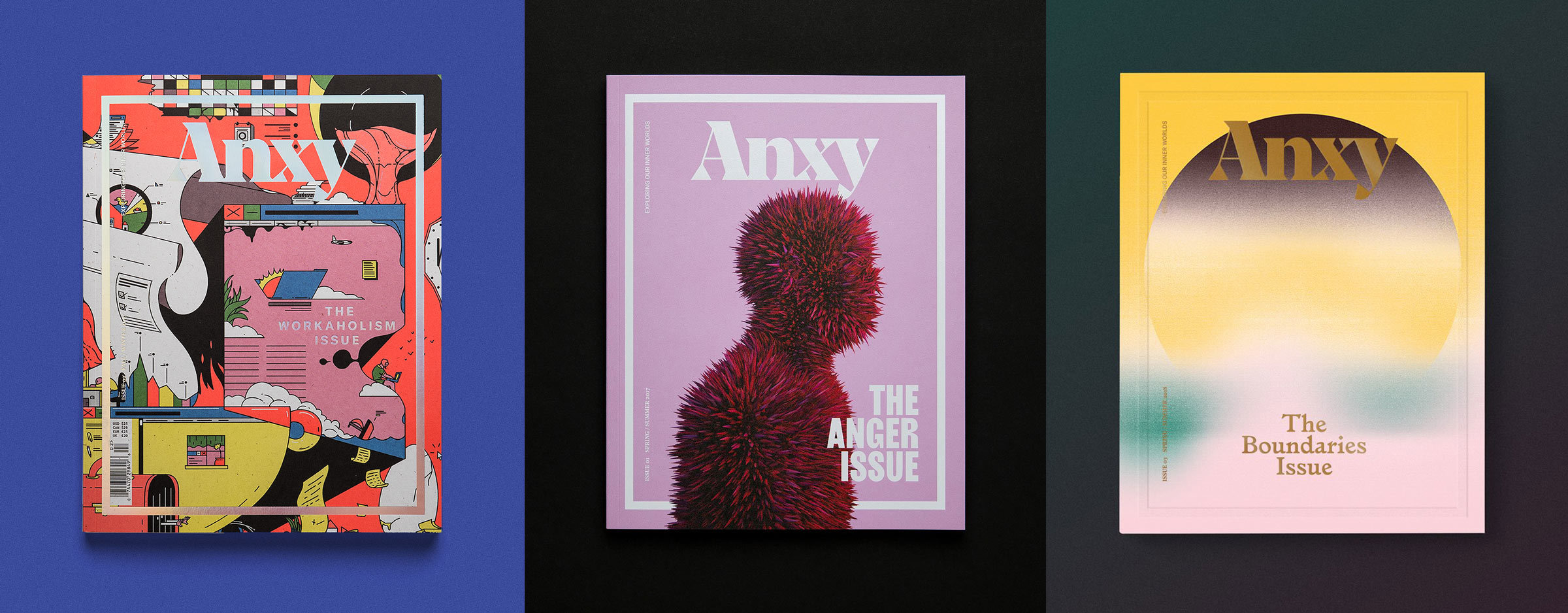
The covers for Anxy Magazine, beautifully designed by Anagraph.
I saw Indhira Rojas speak at Bond Conference in San Francisco. At that point, I had already collaborated a bit with her studio Anagraph on their logotype, but I didn’t get the chance to work directly with her. What I remember of Indhira’s presentation was a totally heartfelt and personal story told with warmth, conviction, and beautiful typography. I was thrilled when she reached out to talk about a cover for Anxy, an independent magazine about, among other things. “the fears that fool us into believing that the rest of the world is normal and we’re not.”
The subject for this magazine was masculinity. As a dude, I have always made an effort to keep a safe distance from masculinity, or rather the glorification of it. Growing up, my father was a hero in this respect. He had no interest in aggressive competition, macho behavior, or fighting. On the contrary, he was quite interested in things like ironing, Julie Andrews, and baking the best homemade pie you’ve ever had. I loved how counter-culture my dad was, and how he made no effort in subscribing to the conventions of what a man was or should be. In short, I’ve given some thought to masculinity, and was interested in how those thoughts could morph into typography.
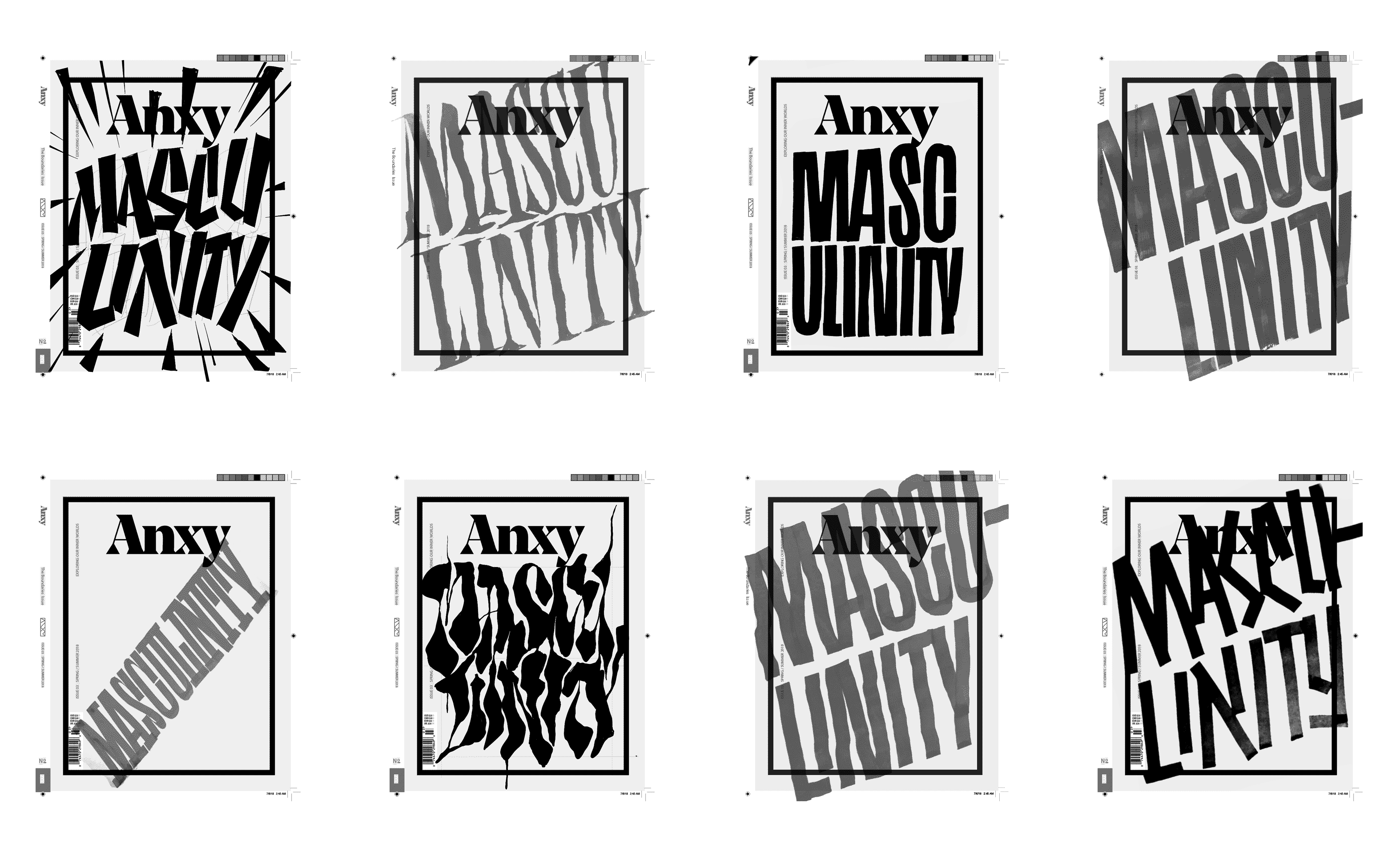
The first round of quick sketches.
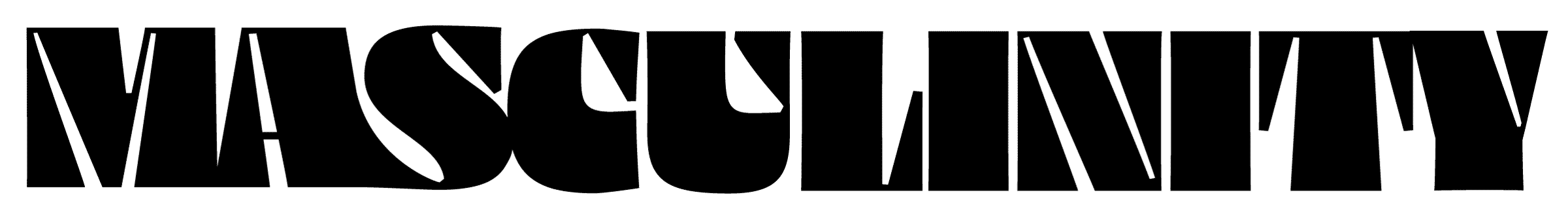
My initial experiments weren’t too subtle. When you have a concept such as this, you can either go with it, or against it. My thought was that masculinity is too blunt, dominant, and obvious to require a delicate or subtle approach. It felt much more natural to create something that made the Anxy logotype feel tiny by comparison.
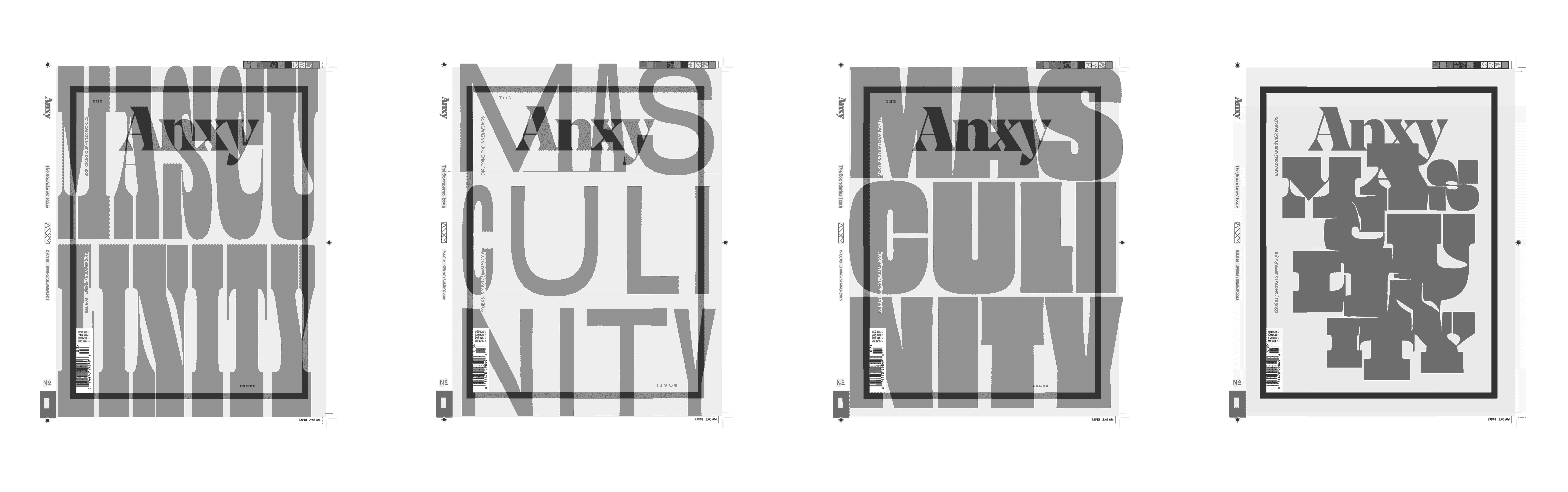
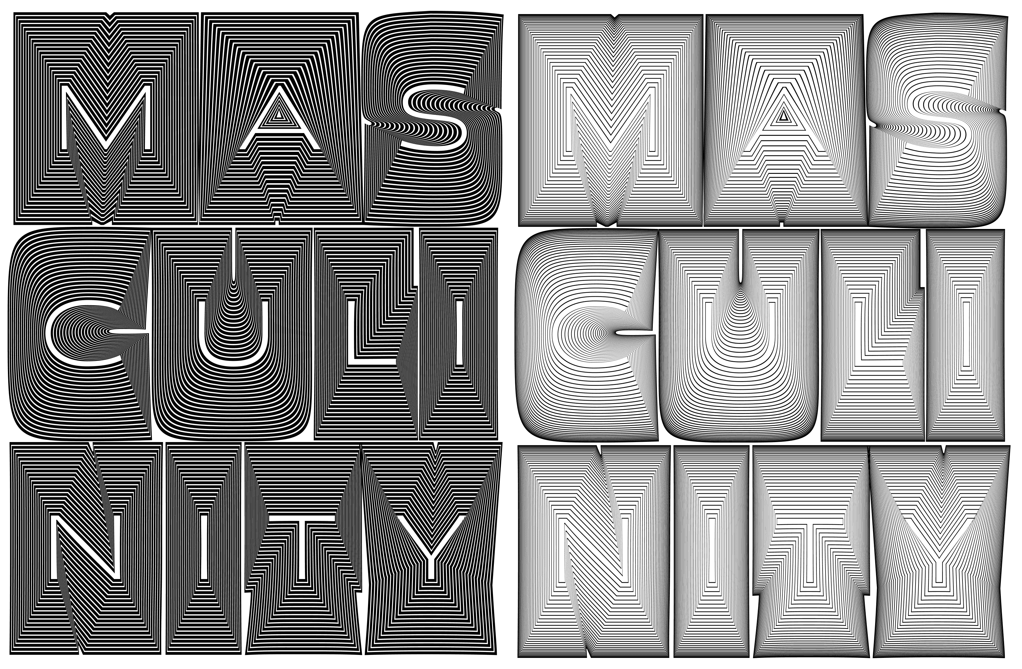
Round two of sketches were more type, less lettering.
From there, we explored some options of how we could get the letters as massive as possible on the page. It’s can be tricky to get line breaks in logical places, so some experimentation was required. At this time, I was working a lot on my typeface Obviously which gave us the weights and widths to totally fill any available space.
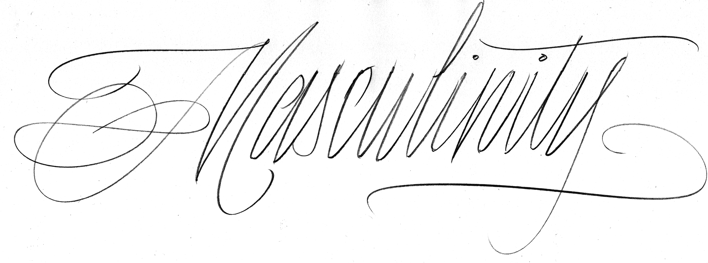
For a breif moment we played with overlaying a light script form of the word over the sans, but this ultimately wasn’t adding anything beneficial. That form of the script M is based on Doyald Young’s masterpiece Young Baroque.
For a brief moment, I thought of doing a custom type sketch for this, but Obviously turned out to be a better fit.
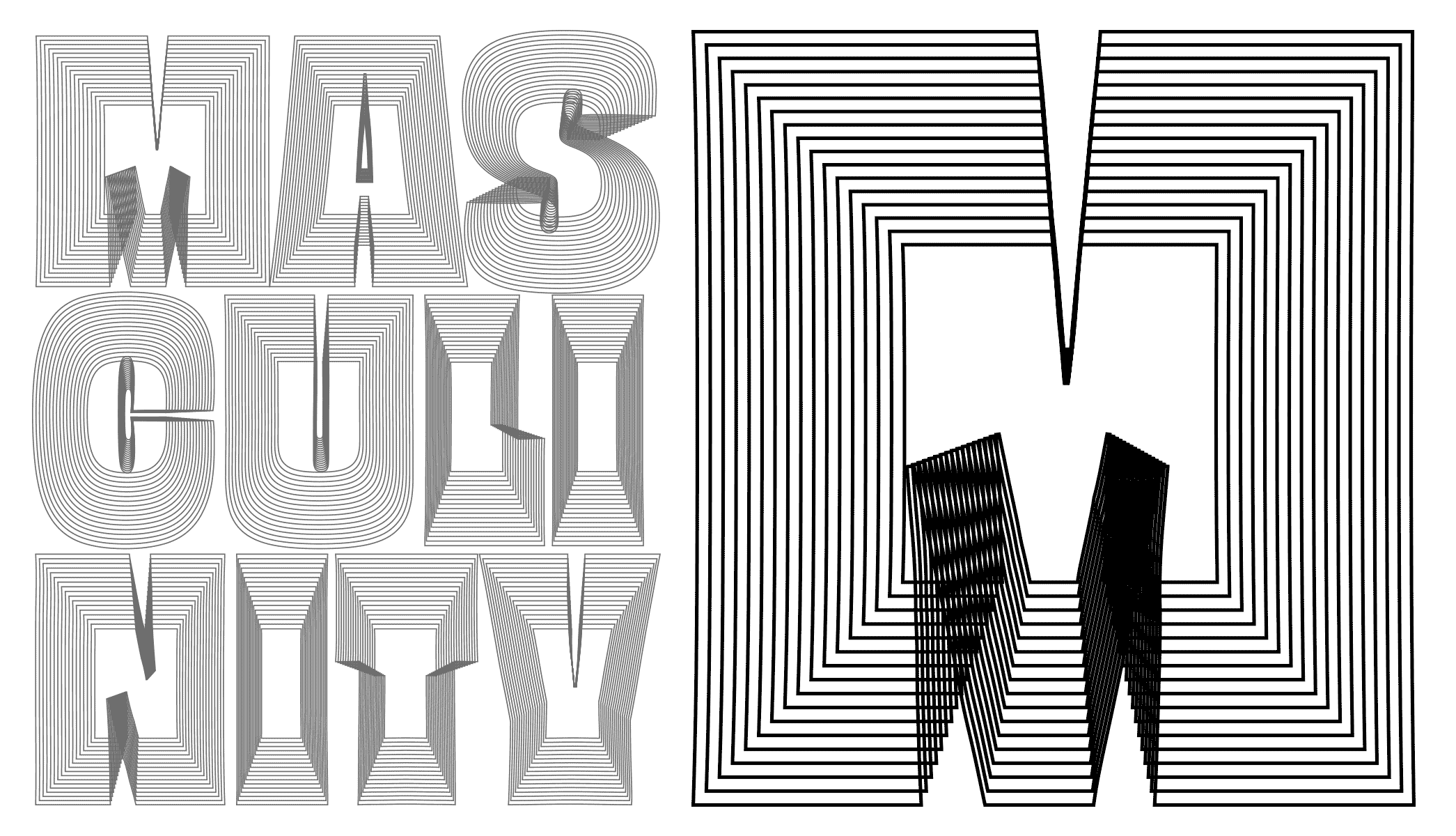
Many instances blended and overlaid added a layer of complexity. This sketch was done by the folks at Anxy.
Indhira sent over some drawings of how they were playing with the letterforms. They were all really interesting, and my job then became figuring out if there was a better way to do that.
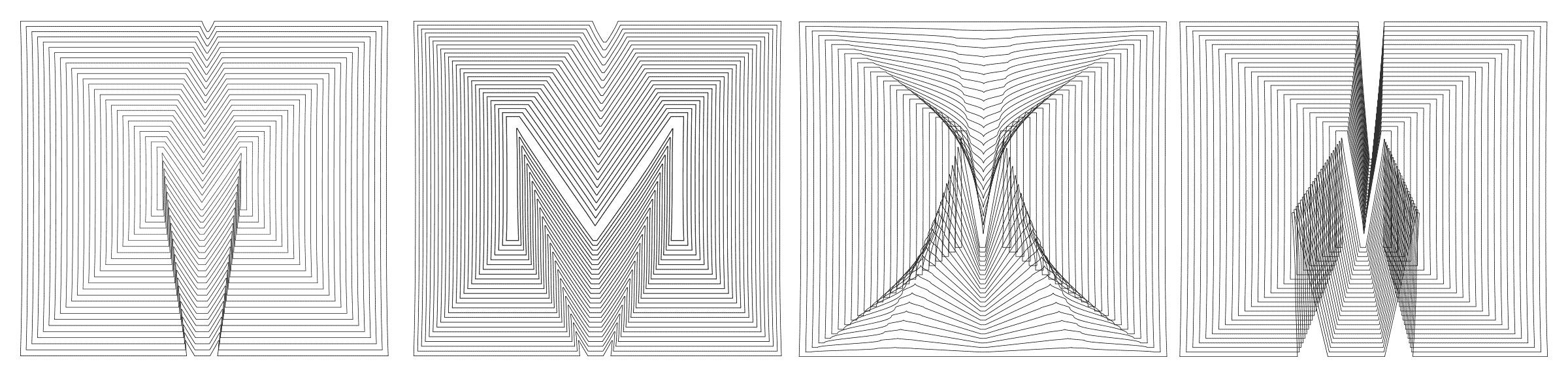
I tested a few options for how two instances of the same letter could blend together for some wild forms.
By blending from a super bold slightly narrow letter on the outside, to a slightly wide and significantly lighter letter on the inside, one could cover the page in lines evenly without overlapping.
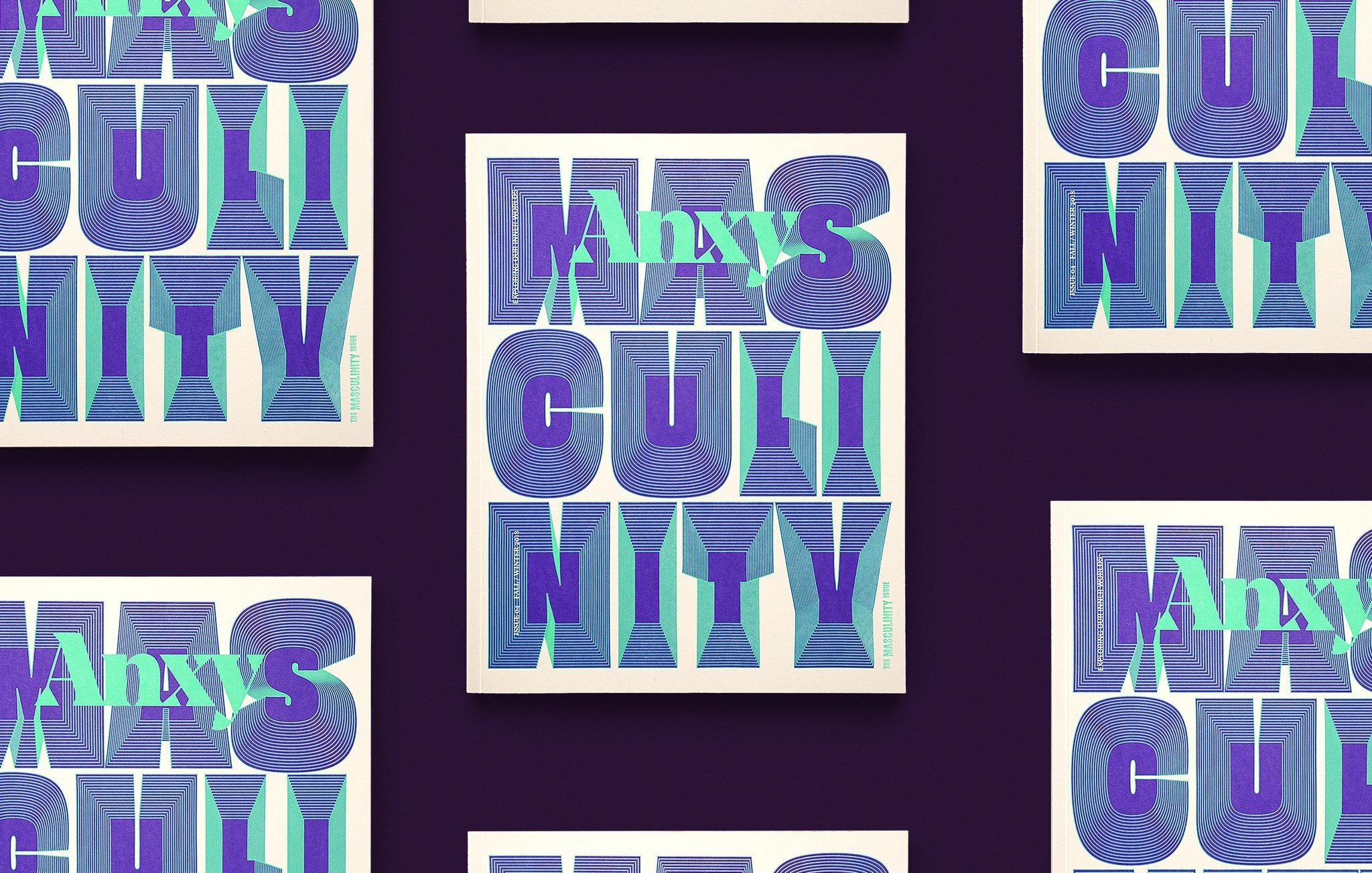
Ultimately my blending experiments came out looking too textural or difficult to read, so we ended up just going with something similar to the first version. Luckily for me, I didn’t have to choose colors, and the folks at Anagraph did a wonderful job.
The cover came out very assertive and loud, but it also hints that there might be more to the concept than we think. Masculinity is complicated, and like all their work, Anagraph handled the design with thoughtful nuance. It was an honor to collaborate with such amazing designers! Now, having spent some time with the issue, I’m totally blown away by the content, and even happier to be a part of it. There are deeply personal stories of oppressive machismo, transitioning, and something I can totally relate to: how becoming a dad completely turns your world upside-down. If you’re interested, you can get it at their shop.