Whether it’s a gift, an envelope, or a sack lunch, at some point in your life, you will have to write someone’s name on something. You will probably love that person, and you will probably want that person to feel a hint of that love simply upon reading their name.
As someone who has dabbled in calligraphy, but never put in the practice required to get good, I’ve pondered the best bang-for-your-buck styles of writing. Some would argue that would be the whimsical script, bouncy baseline, brush pen style that has dominated Etsy stores, wedding invitations, and holiday cards for a few years now. I am not a huge fan of that style, so it won’t be addressed here.
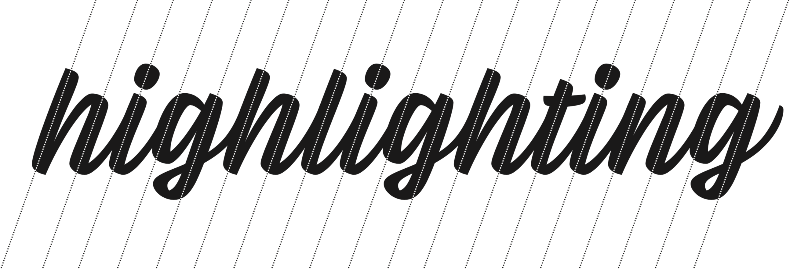
In my experience with type and typography, I’ve found a thoughtful consideration of negative space to be the unsung hero of composition. With that in mind, I wanted to find the style of writing that facilitated the easiest spacing. As it turned out, the medium contrast connected script turned out to be it.
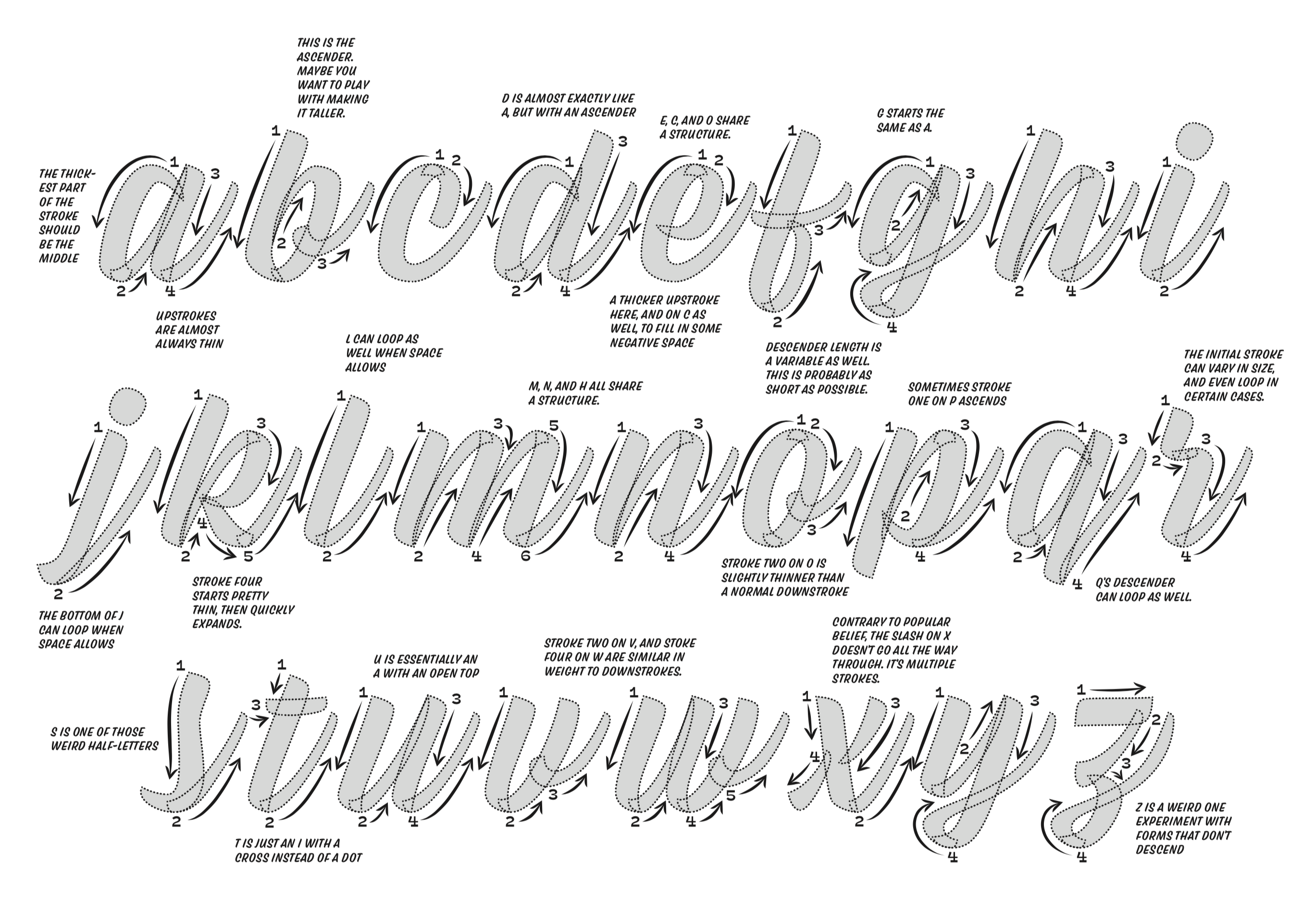
An overview with ductus showing the lowercase alphabet. Originally, this exemplar was drawn with brushpens in mind, but it holds true for the chisel Sharpies too. Take the ductus with a grain of salt. Use whichever order and stroke direction that works for you.
Because of the many repeated vertical strokes, all one must do for normal letters (like a, b, d, g, h, i, j, l, m, n, o, p, q, t, and u) is apply a picket fence rhythm. The italic lowercase alphabet shares so many shapes, that spacing becomes logical and rhythmic.
Now that a style is locked down, we must find the tool that will execute it best. After lots of experimentation, I find the easiest to control is the Sharpie Chisel Tip. The chisel allows downstrokes to be thick, and one can tilt the pen slightly to allow for thin upstrokes. This rule of thick downstrokes and thin upstrokes gets you about 90% of the way there!
This lucky combination of normal letters shows how the picket fence rhythm gets applied. Certain weirdo letters like z or k might throw this off slightly, but more or less, you’re shooting for the old “counterspace equals letterspace” rule of thumb.
One added benefit of this style is how forgiving and adaptable it is. If you accidentally make a downstroke an abnormal length, you can start a bouncy baseline. I try not to go crazy with bounce, but a little is fine. Also, if you want to change the incline to be perfectly upright, that’s more than ok. All of the parameters of weight, width, incline, bounce, contrast, or whatever else you can think of are all ready for experimentation.
Adding on the Capital
The world of script capitals is vast, and it can seem that there are almost too many options. For this reason, I like to change the size and level of intricacy to fill the desired size. Also, sometimes I write the lowercase first, then add the capital in order to better center the name.
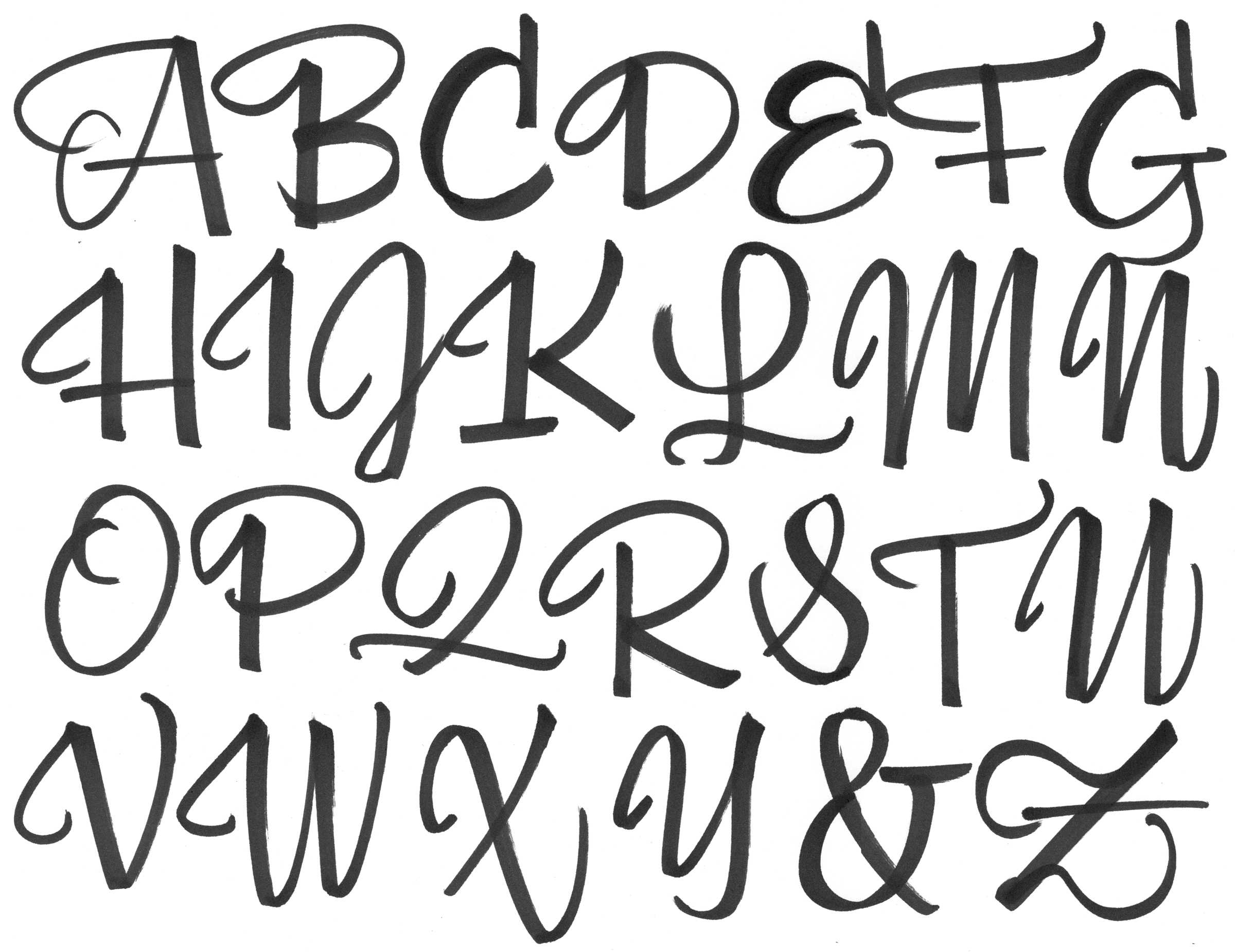
I’ll be honest, I had to touch some of these up. The point is this: hold you wrist stationary, and make all movements from your elbow. That's the easiest way I've found to get a confident line, and confidence is key!
A few more quick tips
Warm up a couple times.
If you’re going for centering the name, do it once on another sheet of paper, and position that over your desired substrate, so you know where to begin.
Add sparkles wherever necessary. The make it look more fancy, and sometimes do a good job of hiding compositional mistakes.
Consider the tool. The chisel sharpie wants to write at about a 1 inch x-height. A standard sharpie could be half that. A ball point pen probably shouldn't go larger than a quarter inch or so.
Consider the substrate. These names might look terrible on a tiny 3" × 5" card, and could even be too small on a poster or sign.
Trace! Feel free to use Viktor Script as a starting point, and do whatever you want on top it. That way, all the spacing and composition decisions are made already, and you can just focus on the writing.
In general, this article is insane, and there is no wrong way to write a name on something. In the end, something heartfelt, unique, and evocative of your own true handwriting could very well make a more emotional impact.
And as Mushy Krongold says, "In the words of many terrible instructors: have fun and make it your own!”