1994
As a kid, our family would take a yearly vacation to Sequoia National Park. My dad was a high school English teacher, and I have five older brothers. This meant we’d all cram into our 1986 Chevy Suburban and make the four hour drive from San Luis Obispo, California, to outside of Fresno.
I was not yet aware of my own burgeoning obsession with letters, but the National Forest sign was a friendly reminder that we were almost there. Seeing the routed out yellow-on-brown signage was thrilling. We’d stare out the window and watch as the elevation increased and our ears popped.
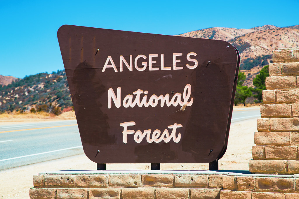
The unmistakably inviting National Forest sign. It has been traced, photocopied, and sent via smoke signal so many times, that the details softened over time like the toes on the Statue of St. Peter. Photo by Tony Webster.
2012
Fast forwarding twenty years to when a huge amount of time is spent dreaming up cool type projects, this upright casual of course came to mind. Unfortunately, my skills in type and lettering in 2012 kept me from realizing this style to an acceptable level of finish. Like a lot of beginners, I was aware that something was wrong, but I didn’t know what.
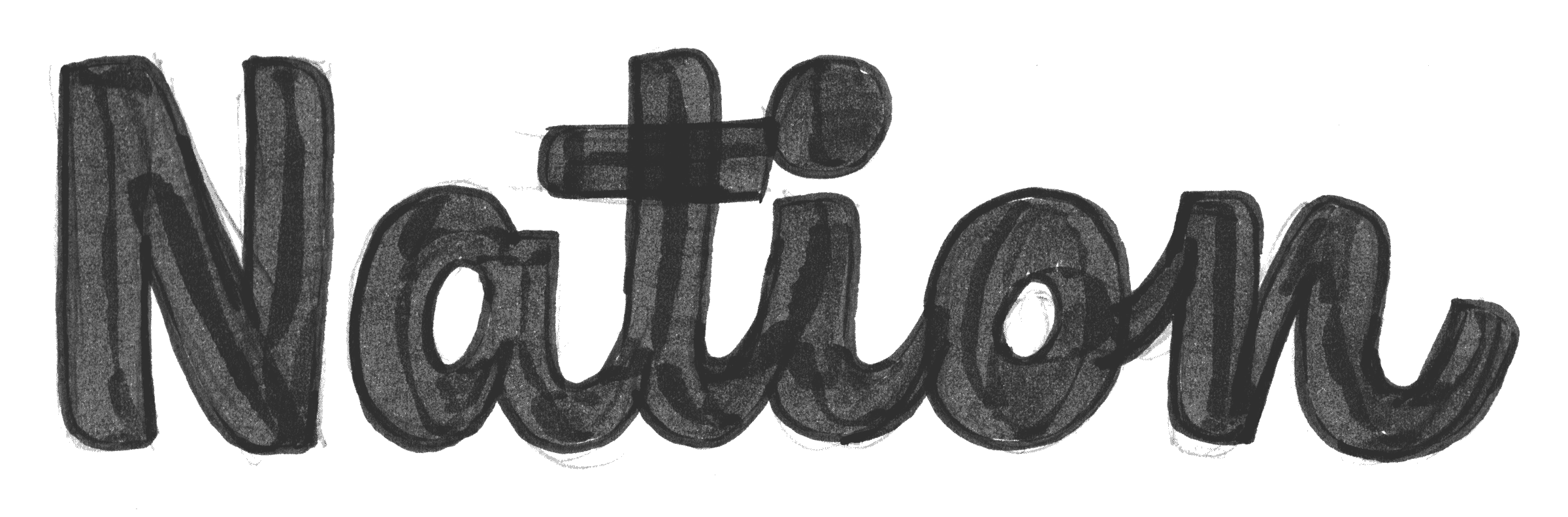
An sketch from early 2012 fails to hit the mark.
2013
A huge takeaway from my time studying at Type Media was the idea that the type of pen used, the angle at which it is held, and the path it takes decides everything for you. At this time, I was obsessed with the Pentel Pocket Brush. Conveniently, when applying a majority of the nib flat against the paper, that pen produces a stroke not unlike that of a signpainter’s quill. I was struck by how suddenly the contrast felt closer to what the original was doing.
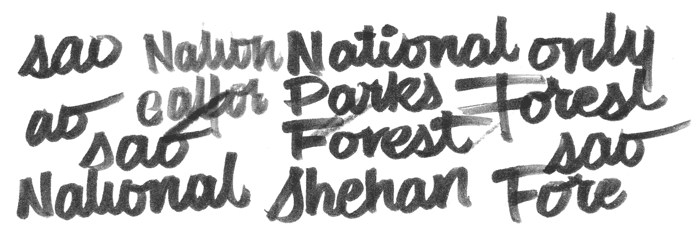
A few years later, I was still obsessing over this style. I drew this in The Hague, clearly homesick for any trace of Americana.
The main difference between the above doodles and the previous “Nation” sketch is the influence of the pen. There is a huge distinction in how lively, organic, and warm an a with a higher joint can feel. In 2012, I was too naïve to notice this.

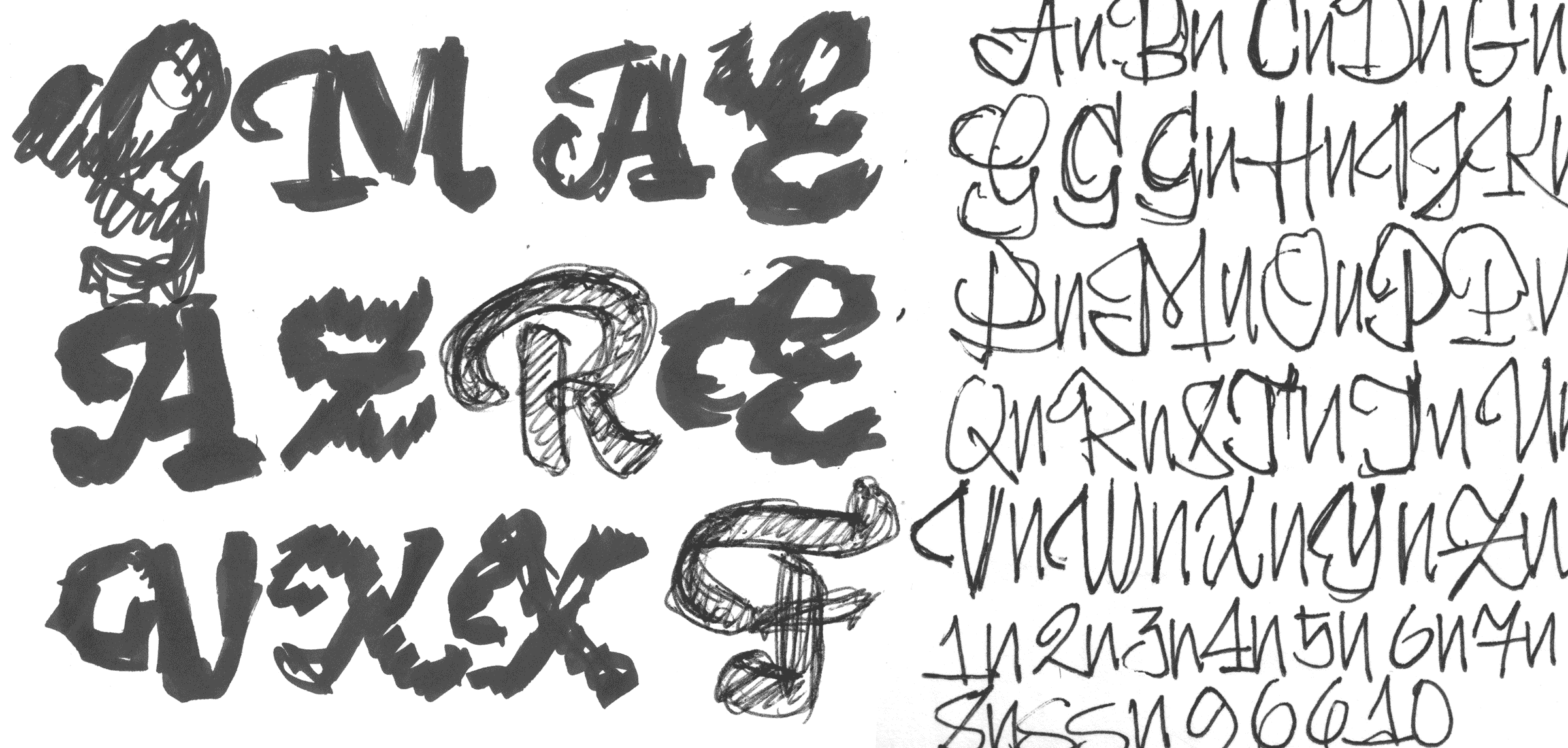
Left: When joints are low, script and italic letters feel childish and twee. Right: Raising the joint on a is more faithful to the path of the pen, and produces letters that don’t make you want to jump off a bridge. The counter with a slight axis feels more lively and organic, just like the National Forests themselves.
Somewhere along the line, I couldn't take it anymore, and felt the need to go into the computer. I was relieved that a combination of the casual shapes with a plump weight permitted nicely overlapping connections without the need for alternates. The sacrifice was that there were long exit strokes at the end of each word.

2014, the first version of this typeface in beta form. The high crossbar on t is a bit of a type sin, but in this case excusable, as it is a salient feature from the source material.
At this point, I fell temporarily out of love with this design. After I graduated, I moved on to Hobeaux, Viktor Script, and the subsequent other typefaces that have comprised the early Ohno catalog. I was probably convinced that the National Forest Script was too cute to be intellectually satisfying to my increasingly esoteric taste.
2018
Four years later, Travis, Lizy, and myself got to work on Future Fonts. Months, after that, when Nick Sherman joined the party, we wanted to get all of our trail type-inspired projects all in one space: Nick’s Forester, Scribble Tone’s Wildberry, and what was now called Coniferous. The immediate response to Coniferous was way more positive that I expected. It seemed as though there were many designers that had warm fuzzy feelings for this style, rooted in their own childhoods.
SIDEBAR: THE NAME
I am aware that Coniferous is a dumb name, but I am trying to branch out in terms of parts of speech. Obviously was my first adverb typeface, and Coniferous is my first adjective. Soon, I will release my first preposition typeface, as long as I can get the copyright.

Nick reminded me of the Sign and Poster Guidelines for the US Forest Service, and I uncovered the charming but decidedly hideous drawings that are still in use today. These have obviously been revised and expanded by many folks over the years. Just look at the “um” in “Monument”. Someone clearly took the available letters in “National Forest” but was clueless on how to execute the u and m.
2019
There was a lot to clean up after seeing this with fresh eyes four years later. One of the more blatant oversights on the early work was a consistent pen angle.

- Apparently I thought it was ok to adjust the angle of the pen dependent upon my mood, or whatever most easily fit the letter.

- Slowly starting to whip it into shape.
Soon, my dissatisfaction with the terminals came to a tipping point. Instead of a lonely arm outstretched for an absent partner at the end of every word, a set of alternates was created that were specifically drawn for the context.

It’s so sad to see a connecting stroke going off into negative space.

I hesitate to employ the ”alternates for everything!” approach to connected script problem-solving, but in this case it made sense.
Swash capitals began to enter my mind as an indulgence too sweet to resist. It’s usually a bad idea to bury such a time consuming investment in an OpenType feature—the probability of those glyphs seeing the light of day goes way down—but it added a whole new dimension and set of applications to the typeface.
These sketches set a personal best for how rough a drawing can be while remaining useful to the process.
EXPANDING THE DESIGNSPACE
Having been staring at the bold weight of this typeface for the entire time, I began getting curious about a light version of this style. Admittedly, light brush scripts are not my favorite genre. A brush script that references anything close to signpainting needs to have enough weight that it could feasibly be created with the tool it references. This naturally came out much narrower than the existing Black, which kept it from appearing weak and spindly. Once they were interpolating, the family consisted of six weights that could be mixed and matched at different sizes to create the illusion of a single piece created with one brush.

When using a combination of different weights at different sizes, a visual consistency in tone gives the illusion that the entire lockup was created with a single brush.
FOR THE ENJOYMENT OF FUTURE GENERATIONS
The idea of this typeface has been kicking around in my brain in some way for a long time, and I’m happy to see it officially out in the world. I am appreciative to Teddy Roosevelt, the National Parks Service, and US Forest Service for preserving the natural beauty we stole from Native Americans. I am very thankful for my folks for making our yearly trip to Sequoia. I have heartfelt gratitude for everyone that supported the project on Future Fonts. I would love to find out what lettering artist is responsible for these original drawings, because I want to thank them the most! ✌