Some projects are a clear-cut path. Hobeaux Rococeaux for instance was as much of a straight line as something can be: take Hobeaux, make it Rococeaux. You can describe the font using only the name! ¶ Irregardless exists at the other end of the spectrum. I have no idea where it came from, and for much of the time I spent working on it, I had no idea where it was going. It was an exercise in fighting my impulses and drawing habits to create something that felt new and uncomfortable.
Do the opposite

The crude beginnings. Top: Take Vulf Sans Light Italic, and middle: squeeze the hell out of it. Bottom: Add more digital slant because the compression took most of it away.
For some reason, I didn't sketch everything out by hand at first. I just took Vulf Sans, squeezed it by 30%, and began correcting everything to low contrast. Occasionally I would make a big move to introduce some chaos—like raising the crossbar of A to an absurdly high waist, or introducing unicase forms.
Teaching for a few years now has shown me that the most crucial part of type design is editing ideas. Getting a feel for how much is the right amount of interest in a display font is tricky. In the back of my mind, I'm striving for Cooper Black—a typeface so successful and succinct that it has and will be iconic for centuries. I don't know if it's possible to get there, but I think about it quite a bit.

The first iteration remains fairly close to the final product. The biggest differentiation here was the lowercase version of E and I. Later, I had to raise the waist of X and C, clean up weight and contrast issues all around, and make all the spacing more consistent.
All of this is very weird for me for a v1.
- I always sketch by hand first.
- I tend to start with a bold, and I never begin with italics.
- I avoid high-waisted forms because the P and F pose spacing challenges.
- I avoid that form of J for the same reason.
- I would never have a closed C shape with an open S shape!
- I am pretty averse to anything that could be called “unicase”
It's very freeing to embrace the opposite way of working. It was an experiment, and as Sister Corita Kent says, everything is an experiment. In the back of my mind, however, I knew I had to be a good boy and explore the designspace before I settled on anything.
Other weights, constructions
There is nothing faster than doing shitty sketches, and they can tell you a lot! To do them even faster, I like to work in Procreate, and trace existing screenshots from current projects.
After about two seconds of sketching the lowercase, I thought I should make it a connected script.
The spirit of this idea was adventurous, and a bit experimental, so why not have a connected script lowercase? Connections are always a challenge in script typefaces, and getting the trickier ones solved is often an irresistible puzzle. I've played a lot with script fonts, and the strategy that works most often is having each character terminate about halfway up the x-height. Still, that leaves a handful of lowercase letters that require some alternates, but it solves about 90% of the problem.

The beginnings of the script. Most of the connections seem to work without too much trouble, but things around s, o, and a few others were pretty problematic.
While it was fun to look at and fun to play with, I ended up feeling like this script thing was adding another idea to a full plate. There was enough going on already, so I was forced to kill this darling and opt for a more traditional lowercase. I also put the unicase E and I into a stylistic set to make the font behave more predictably.

Things get a bit more boring in an effort to focus on a more singular concept. For the most part, these are italic shapes, with some sloped roman forms (basically just the a) to add interest.

The a switched to the double-story form, the e became a bit more rigid, and the joints on n and m etc. were moved to a less italic position.
Go bold or go home
Exploring the other weights was a fairly straightforward process. The fun part was getting heavy diagonals thinned out to the right amount so that there weren't any huge areas of positive space.

Making the H, I, or even O bolder is simple, but adding weights to A or N requires a bit more nuance. This is especially evident on the a. Left: adding weight everywhere. Right: adding weight when you can, and thinning out joints for less distracting traffic jams of positive space.
For much of my type design education, I was just trying to just get good at spacing. I would never intentionally mess up the rhythm because I wanted it to operate with machine gun consistency. But because this project welcomes more chaos than normal, I was okay with having a large gaping counter in the O. Yes, if you type ten Hs in a row, it will have a different texture than typing ten Os, yet somehow this discrepancy felt right for the project.
Carrying this idea to the extreme, I was reminded of the Commercial Type banger Giorgio Sans that combines wide alternates for round shapes in an otherwise condensed style. It certainly spices things up.

Giorgio Sans, from Commercial Type makes expert use of the wide alternates for round shapes. I have loved this family since its release, and have always admired the top-notch work that comes from the deft hand of Christian Schwartz.

We have to be careful about how we use these alternates. They are the habanero-hot sauce of the OpenType palette—a little goes a long way.
Creating alternates is fun; it goes pretty quick, so my mind went off thinking about what other Stylistic Sets could increase the utility of this design or which could just be fun.

We had the unicase options from V1, and now the round Os. The I’s dotted with hearts was the logical extension of a typeface that embraces naïveté. Finally, working antithetically to the wide rounds, the narrow forms of J and S were added to remove pockets of whitespace.
The back end of the character set
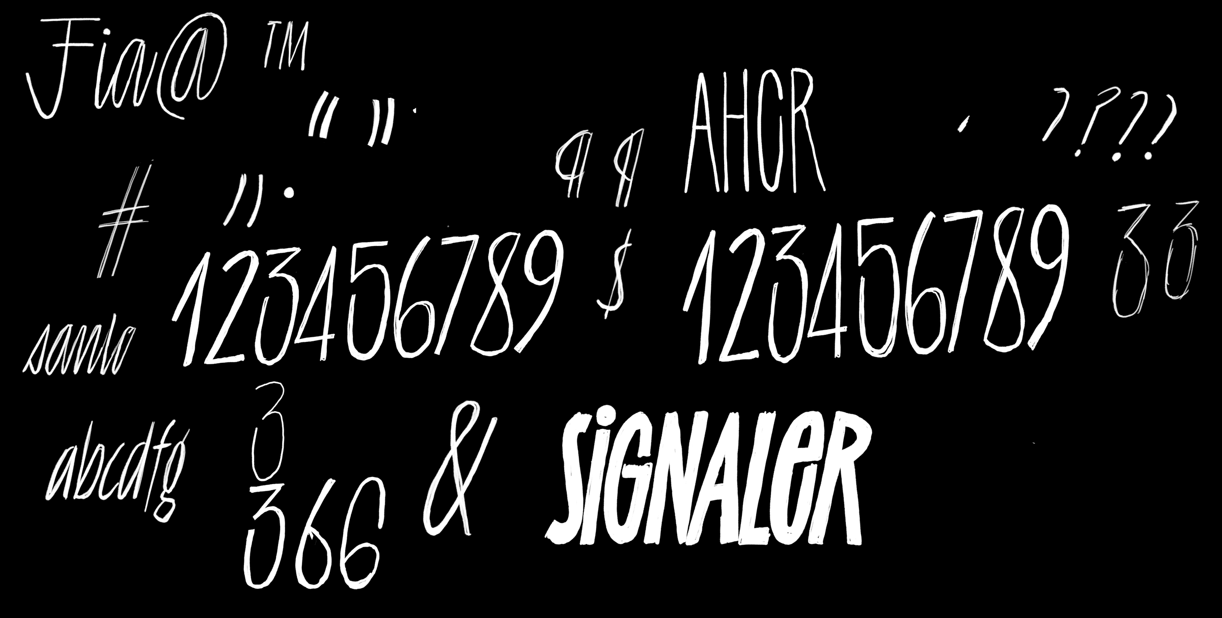
Esoteric punctuation isn't always fun to draw, but something I don't mind is the numerators and denominators. The challenge of drawing the numbers optimized half their original size, with no obligation to use the existing point structure is pretty short and sweet. In this case, they became more uniform in their construction, with 3, 5, 6, and 9 adopting open apertures.

Numerators and denominators are never scaled-down versions of the normal figures; they’re completely redrawn to excel at their smaller size.
Things like the ampersand, the various currency symbols, and punctuation like brackets and the number sign were pretty straightforward shapes. The simple move of raising the waist took these familiar architectures and put them in the same visual world as the alphabet.
Contain yourself
I started putting together a specimen while I was still in the design phase with this project, and instinctively I drew a few shapes to act as containers for various words and phrases. After they were finished, I thought, “Well, I guess I should just include those vector files in the download for the typeface.” That quickly snowballed into, “I bet I could make a font that does that!” Fonts that type dingbats or ornaments are always a bit of a hack because you’re assigning random shapes to letters. Sometimes people try to make it as logical as possible, but whenever we use the fonts, we invariably take some trial and error to do the thing we want. Luckily, in that process, some serendipity can catch us off guard in a delightful way.
It was a bit of a tricky exercise to figure out the best way to get semi-random-looking shapes into a font. At first, I was drawing ten different width shapes for every style of container. That was taking way too long, and I knew there must be a better way.
The simplest solution is always the best, and that’s how I know my final solution is just ok. In the end, I decided on going with a left cap, five middle pieces that repeat in sequence, then a right cap. With this solution, you could make any container as long as you want, and it will look random enough.

A selection of the containers in Irregardless.
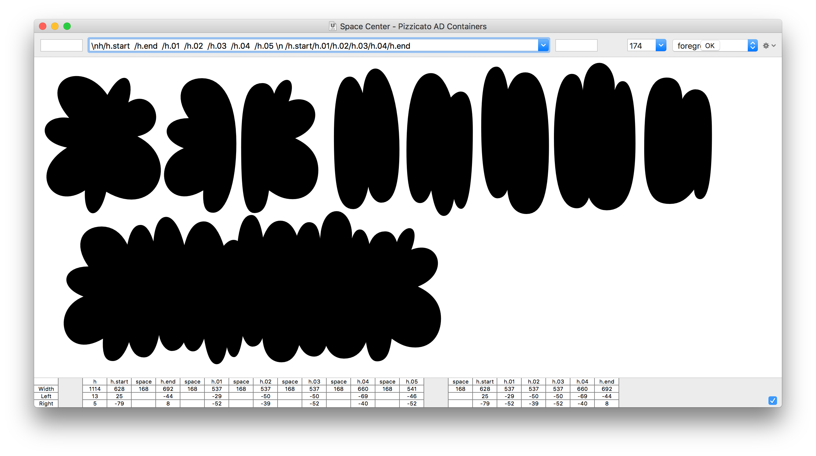
If anyone wants to utilize this method of making a container font, the opentype is really simple, and the drawing is less labor-intensive than some other options. Here’s the OpenType.
The shittiest part of the type design business: Naming
It’s no secret that naming fonts is difficult. All the good ones are taken, which is why I am forced into thinking differently about font names. All the nouns seem to be taken. They're not, in reality, but they seem to be. That’s why I opened up to adverbs (Obviously), adjectives (Coniferous), and words I make up (Blazeface, Covik). For this project, it seemed important to be a little ridiculous, but mostly just memorable. I like it because it is a word that was recently added to the dictionary because of how many people used it when it wasn’t a word. Folks convinced of the importance of grammar are quick to internally cringe when people utter “irregardless” because it’s something you just shouldn't say. It’s a Michael Scott-esque malaprop, and for some reason, I found it appropriate for this typeface. There are deliberately obtuse aspects of this design that are maybe unnecessary but are enthusiastic expressions of a feeling that I’m searching for; Naïve, silly, with unwarranted confidence.