It’s not often we're able to take on custom work. In fact, in many meetings, I’ve found myself arguing against it by saying, “Do you truly need something custom here? There are lots of great fonts available already!” But occasionally I really connect with an art director, we assess their needs and figure out why an off-the-shelf typeface isn’t ideal. That was the case with Edmodo, and my friend, Sebastian Caceres.
Our work for the education technology company Edmodo began with thinking about how and where education and typography meet. The obvious answer was handwriting instruction, which is an incredibly rich history from which to pull. Sebastian and I headed to the Letterform Archive to pull some reference material and get our asses in gear.
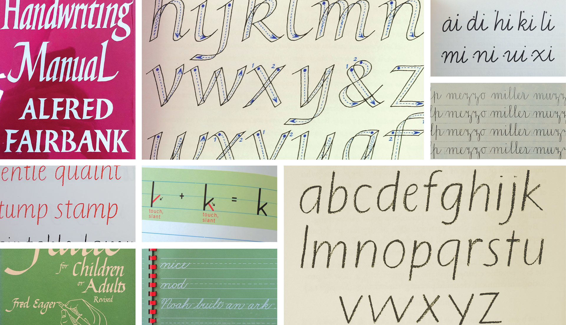
I passed Kate Long at the Letterform Archive a note that we were looking for some handwriting manuals, and boy oh boy did she deliver.
Many things in the world of handwriting exemplars revolve around an italic construction. It’s simply the most efficient way of writing, but connected scripts and a strong slant can feel a bit heavy-handed in the context of technology.
We landed on the idea of an upright italic. Italic to give a nod to the genre of writing in which we were mining, and upright to just dial it back to a palatable level of expression.
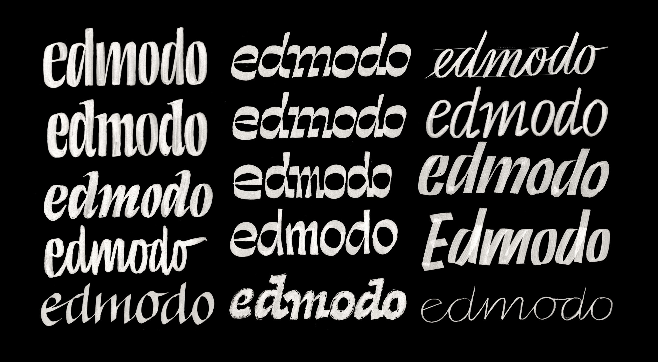
After a few rounds of sketches, we had some directions we could refine and explore.
Finally, we arrived at something unique and ownable. I was chomping at the bit to explore the rest of the typographic system, and fortunately, they had a budget!
I brought on my friend Tommi Sharp to help out with some accompanying icons for different sub-groups within their company, and everything was hunky-dory.

Tommi Sharp’s accompanying icon work did a nice job of complementing the stroke modulation in the typeface.
Missed Connections
In the years that followed, I continued to find myself in a meeting about a new brief, and learn about another company that was in need of a custom typeface. Oddly, they began to blend together, and many of the same words were repeated over and over, in brief after brief: organic, bold, optimistic, human.
In April of 2020, I began working from my basement. The meetings I took down there didn’t win me many jobs. Weird.
But one by one, I lost every single one of those jobs! Who knows why? Maybe I was pricing too high, maybe too low. Maybe people didn’t like the fact that I was taking these calls from a garage. The point is this: I had time in my workday to really think about what this non-existent typeface they were looking for might be. Maybe for all of them, it was the same one.
An Organic, Bold, Optimistic, Humanist
It always makes sense to start from something. The blank page is uninspiring, and making corrections is infinitely faster than starting from scratch, so I brought up the work from Edmodo. With fresh eyes, it seemed pretty out there! I was surprised I got them to go for it!
Gradually, I started removing everything about it that was specific to Edmodo. The intense flaring and upright italic construction had to go. The angled terminals became straight. Every detail was toned down as much as my heart could tolerate. It still had to be “organic”, but over time I’ve learned that an art director’s “organic” and my “organic” are two very different things.

Edmodo’s custom type on the left, and Ohno Humanist Version 1, as it was first called on the right. After showing it to my friend Marty, he gave me the news that I didn’t want to hear: “I love it! It’s so expressive!
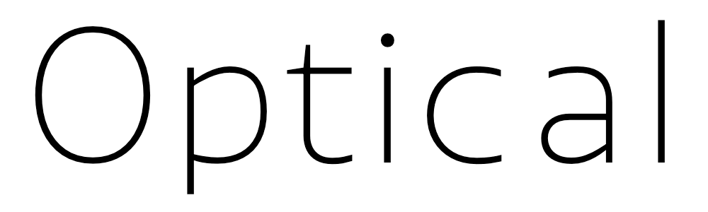
The x-height was still super high, and the spacing was still pretty tight, so this was decidedly intended for large sizes. But one optical size does not a workhorse make. It had to work at the smaller end of the spectrum.
Small text, big problems
On the web, we are very accustomed to seeing Roboto, Work Sans, Proxima Nova, etc used in conjunction with crazy display faces. Even when I put out Degular, a typeface with a Text version, I still saw folks opting for something more restrained to be used in conjunction with Degular Display in the headlines. This was alarming, and a bit disappointing to me, but I learned something. Font users seem to have a lower threshold for expression in text sizes. Even though a text version could technically work at 10 point, it doesn’t mean the designer likes it or will choose it. From a usability perspective, maybe text sizes should be more restrained.
There are a few standard techniques for making a small optical size, but many of them didn’t work as expected for this particular design. Here are four things that normally happen.
1. Contrast goes down.

This made sense, as the display version was just a bit reverse contrast, and had a tiny amount of flare.
2. Details are simplified.

As this was a low-contrast sans to begin with, we didn’t need to worry about this too much. Just a few details got a bit simplified, and we had to make sure the small pockets of whitespace would still be large enough to render.
3. x-height increases.

The x-height was big already, so in this case it actually got a little bit smaller to have more conventional proportions. This is why one-size-fits-all answers don’t work in type design.
4. Spacing increases.

This was probably the most noticeable. But because the spacing increases while the x-height gets smaller, the actual width of the letters doesn’t change too much.
But the most amount of work was actually removing the influence of the pen. As a type designer, this was a tough darling to kill. I’m always drawn to anything that can give a vector shape a little more warmth and life, but we are making this font for designers, and not for me. Believe me, I do plenty of fonts that are just for me!
In the end, everything interpolated, so it was fun to have a slider that moved along an axis of warm utilitarian, to nearly goofy.
Moving around the design space, we can watch it go from utilitarian, to straight up silly.
ITC Kabel Black
For some reason, I had it in my mind that the version of Kabel drawn in the 70s by ITC was a humanist also. The characteristic e seems to have been lifted right out of a calligraphy handbook, and the open aperture of C seems a nod to the pen as well. Much of the time working on Retail, I was essentially drawing ITC Kabel from memory! But one day I opened up a specimen to make sure I wasn’t reinventing the wheel. Surprise! Kabel was intended to be a geometric sans. How could I forget? Maybe it’s the fact that it was drawn by Rudolf Koch, and he simply wasn’t capable of leaving the hand out of his work. I mean, you make Joe Dart play some techno—it’s gonna get funky.
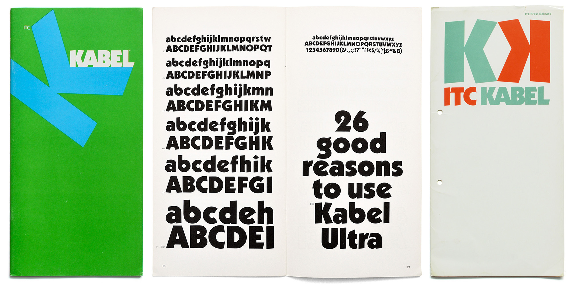
A specimen of ITC Kabel Black. Originally drawn by Rudolf Koch, and then optimized for the 1970s by Victor Caruso. That trademark juicy x-height cannot be omitted when mentioning inspiration for Retail. Perhaps it only looks more humanist than geometric to me, by modern standards.
Bolder, Colorado
The work for Edmodo never went beyond a regular, so the weight axis was ripe for exploration. With all Ohno projects, I am inclined to push things as far as possible, mostly because I don’t know what’s going to happen. Maybe the Black will be the most successful weight, or maybe the Ultra? Unfortunately, low-contrast type is very difficult to pull off at massive weights. In the lowercase, the problem is a, e, and s, which have 3 horizontals to squeeze in.

On the left, we have e and s with no stroke modulation. It’s just a bummer, and impossible to maintain a consistent color with all the different joints and intersections. The freedom to modulate weight allowed for a more consistent overall appearance in words and paragraphs, even if the individual strokes varied greatly.
With the optical size and weight axes happening, we are left with a nice designspace. On the weight axis, I found I needed three source drawings to get my interpolations smooth. I find interpolating on an optical size axis much more doable with fewer source drawings. Here we simply needed the bookends to make everything interpolate gracefully.

So with the two axes together, we had a designspace that looks like this. Source drawings are shown as the “Ra” dots and interpolations as little white dots.
I think in the future, this will be my go-to designspace framework for future projects of this scope. Everything interpolated without any hiccups. If those hiccups were to appear, they can always be fixed with support layers (which are essentially duct tape for a flimsy designspace), but I’d honestly rather just have a couple of more source drawings in there. Knowing that I’m getting clean interpolations puts my mind at ease!
Telling the story
With every typeface, the production work provides a perfect backdrop for my mind to wander thinking about the story I'd like to tell for the release. But for this thing—Ohno Humanist as it was temporarily named—I was stuck without a name!
My list included, Voice, Vocalize, Infer, Imply, Memory, Recall, Slang, Nuance, Salt, Salty, Season, Speak, Spoken, Phrase, Uncle Tito, Regards, Humane, Articulate, Moreover, Furthermore, Mention, Awake, Cache, Every, Everywhen, Prank, Handy, Sandy, Convenient, Strip Mall, Parking, Park, Culdesac, Habit, Minimall, Dollar, Unit, Doug, Dormal, Savemore, Spendy, Inventory, Minimart, Konbini, Plural, Pantry, Pants, Entry, Patio, Usj, Usual, Mortgage, Lend, Index, Discount, Adjective, Abject, Adverb, Toast, Warm, Visalia, Cayucos, Cambria, Carmel, Monterrey, Outlet, Emporium, and Plaza.
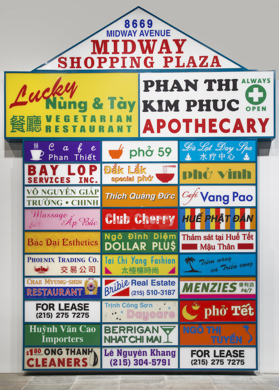
Ken Lum, Midway Shopping Plaza. 2014. Powder-coated aluminum and enameled plexiglass. Ken Lum’s intention behind this particular piece relates very little to the concept of Retail, but visually, they are inextricably linked.
That’s a lot of shitty names. Many of which are already taken! In distress, I messaged my good friend Kel Troughton, the guy that inadvertently named Degular. Kel said, "I'm rollerblading right now. Gimme an hour, I'll call you back.”
During our phone call, Kel said, “I know what you’re trying to get at with this Strip Mall stuff.”
“Right,” I said, “that’s it. But I can’t just call it ‘Strip Mall!’”
“Yeah, exactly. What about ‘Retail?’”
Kel did it again! It was short, with no repeating characters, and a capital R. Even better, it didn’t really sound like a font name and was thusly unused. Done and done. Also, the vernacular of Strip Mall signage is one of my favorite pockets of graphic design. Each one reads as a “top 10” list of the most proliferated display fonts in history. Retail aims to be at home among them. Honestly, all my work does.
Italics and Beyond
One of my favorite things about Degular was combining the italics and the romans into the same variable font. That meant you could just change the slant while you were messing with the weight or optical size. It’s a nice and tactile way of moving between styles, and I’m surprised it hasn’t caught on more.
Of course, italics in a grotesque (more like obliques) are easy to pull off with the same point structure, but could this be done with a humanist construction? After all, some humanist italics are pretty insane!
In the interest of efficiency, I kept the italics as simple as possible. After Swear, with two italics, I am still italic’d out! We did change where the strokes branch off, which is a small move, but immediately echoes through the entire lowercase.

The italics are simply obliques with a dash more italic energy thrown in via the lowercase joints. Is it a poor man’s italic, or a rich man’s oblique? You decide!

With optical size, weight, and slant, the designspace enters the third dimension!
This is around the time I start planning my exit strategy. When a project has been snowballing for as long as this has, I know I need to get out soon before I’m crushed by the weight of my own creation. Still, I couldn’t help but add a few alternates!

In addition to all the usual suspects (non-lining figures, small-caps, etc), Retail features a thorough range of stylistic sets for playing around.
They were mostly inspired by the sloped stems on Windsor, the tilted e crossbar from Kabel, and the need for a few italic forms. It’s a slippery slope with stylistic sets, so after number six, I had to shut the door and move on with my life.
Retail. For retail.
The result is Hairline, Thin, Light, Regular, Medium, Semibold, Bold, and Black. Text, Normal, and Display sizes. And everything has a corresponding italic. 48 styles. That oughta do it!
I know we’ve seen much more exploration into grotesques in the last 10 years, but I personally think that the humanist genre is ripe for more experimentation. We haven’t hit it on the head yet. But Retail—let’s be honest, a typeface mostly designed to grease the skids of commerce—is one effort in that direction. Use it when a grotesque is feeling too cold, and don’t worry about making your layout fit the qualities of the type. If I’ve done my job, it should go the other way around.

The whole dang thang.