I started Ohno in 2015, born from a love of expressive typography and craft. But just 8 years prior to that, I was a college dropout with no skills, no money, and plenty of time. Now if you have plenty of time, here’s my life story.
2001
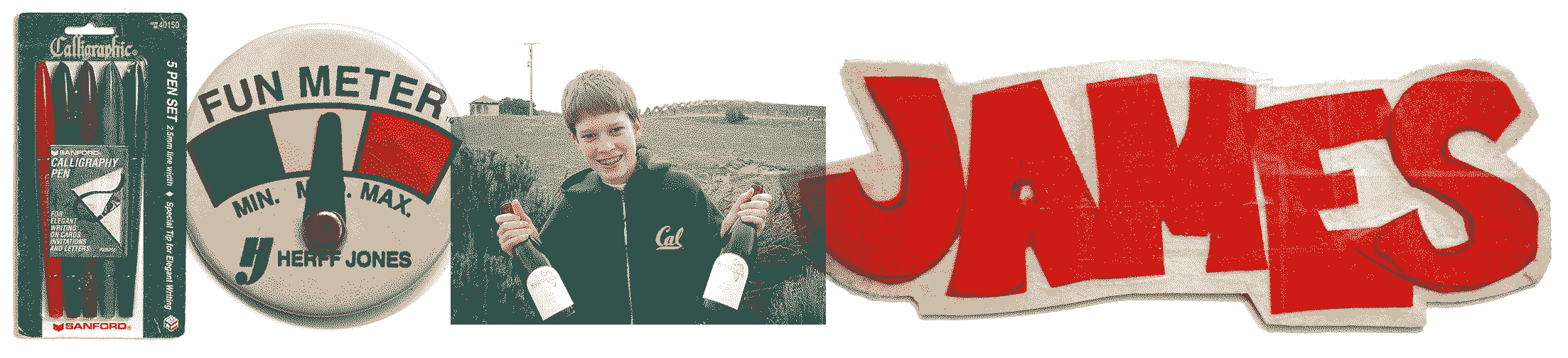
My father was an English teacher, and although money was tight, he’d indulge my brothers and me with whatever school supplies we needed. In 8th grade, I picked up a pack of felt-tipped Sanford “Calligraphy” pens. I marveled at how contrast naturally flowed out and spent hours recreating the shapes from the included manual. Why were my friends not already stoked on this wonderful hobby? It was certainly more fun than Tony Hawk’s Pro Skater.
2003
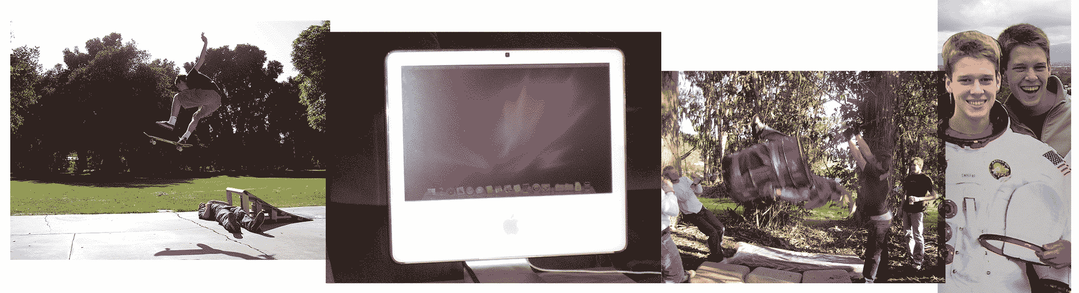
I vividly remember saving up for my first Mac. After teaching myself rudimentary Photoshop skills, I started working small graphic oddjobs that paid as much as $15/hour! This blew my current wages as an ice cream scooper out of the water, and I was able to say goodbye to that hellhole forever. It wasn’t long before I was the proud owner of a 17" iMac with a pirated version of Illustrator, and hundreds of fonts for me to peruse and abuse.
2005
I had made very few friends in the first two years at college. It didn’t feel on brand to just drop out completely, so not wanting to disappoint my parents, I told them something about “taking a year off” when my brother offered me an internship at his new start up in San Francisco. “Paul’s little brother” was my name, and Powerpoint was my game! I actually loved it, and spent hours and hours in the bowels of graphic design. My skills gradually sharpened, I moved onto InDesign, the internship turned into a job, and San Francisco became my home for the next decade.
My first foray in the whacky world of type design was a website called Fontstruct, which is actually still operational. Building pixel fonts was great fun, but those weren’t quite the fonts that I wanted to make, and I still didn’t know much about graphic design in general.
2007
A friend suggested I check out California College of the Arts. I applied, got in, and paid tuition without even checking out the campus. I had terrible nervous diarrhea on my first day which is almost always a sign you’re on a good path. CCA was the first school I felt at home. The faculty was kind, supportive, and skilled. The campus was beautiful, and unlike anything I’d seen. The food was... just ok, but it didn’t matter! I was right where I wanted to be, and at least the bagels were ok.
At that time, blogs were the source of all news in the type world, and through reading those such as I Love Typography, I learned about a mysterious and alluring post-graduate program for type design called TypeMedia. It seemed to be a combination of Hogwarts and graphic design school, and I was all in. I talked about it to everyone who’d listen, and eventually sent in my application.
2011
Jon Sueda was an incredible presence at CCA. I never even had him as a teacher, but he somehow knew me, and knew I was becoming more and more obsessed with type design. One day he took me aside and said, “Why don’t you go all in on type for like five years and just see what happens?” The fact that Jon even cared enough to take interest in me is remarkable, and I took his advice to heart one thousand percent.
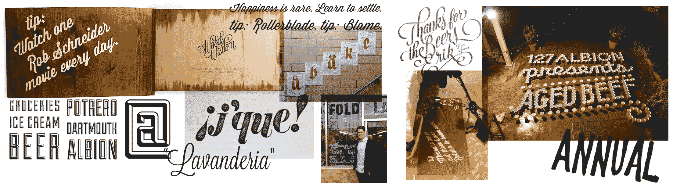
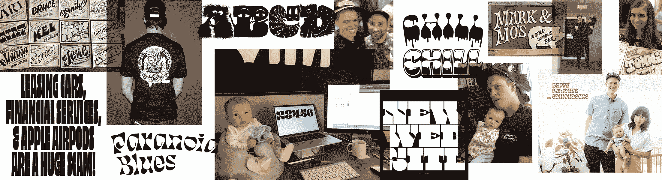
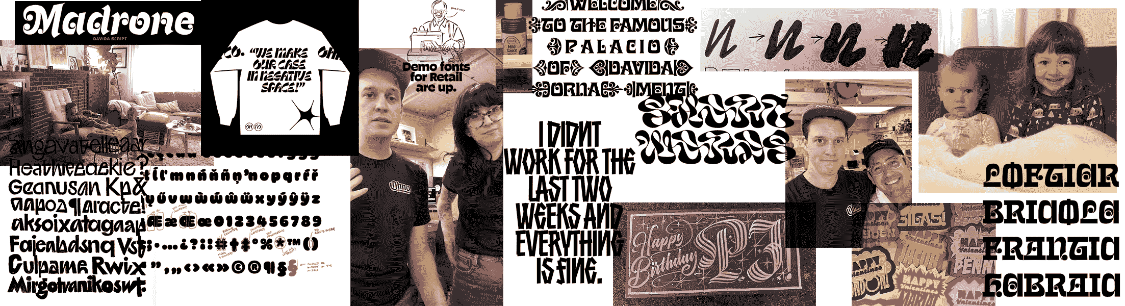
Around that time, Lost Type (a then brand new pay-what-you-want type foundry) had just launched, and I sent in my first fledgling typefaces to be considered for distribution. They were accepted, and on the day of the release, my phone began buzzing every few minutes with $1-$5 sales. It was completely and utterly amazing to me. How could a font that I made in a week be worthy of someone’s actual money? On its first day, Wisdom Script generated over $700, and I thought to myself, “this might be my ticket out of Powerpoint.” I continued to release projects with Lost Type, and I’m forever grateful to Riley Cran for being an encouraging voice, and teaching me that my passion was actually a viable career.
2013
By the grace of God (or sheer dumb luck) I got into TypeMedia, and flew out to The Hague, Netherlands. It was the hardest year of my life. I was homesick, school was tough, and the rain just wouldn’t end! Until one day it did. The skies parted, the sun shined down on our group of graduates, and I left that program incredibly grateful to the teachers and friends I made. The weird thing is I’m still learning from my time in TypeMedia. I had no idea how much you could pack into a single year. When it was over, I was exhausted, but eager to start a career as a professional type designer. All I needed to do was find a job.
2014
As it turns out, not too many jobs in type design! But the limited opportunity turned out to be a good thing. In between occasional lettering commissions, I began experimenting with what my vision for my very own type foundry could look like. At this point I’d seen enough historical material to understand the vast possibilities in type, but the landscape at that point felt so restricted, professional, and sterile compared to the things I was interested in. The point of a new foundry would be to celebrate everything I loved about type, and wasn’t seeing on myfonts.com.
I set up a desk in the back of a t-shirt shop in the Outer Sunset. It was there that I started cooking up new versions of Hobo, and exploring what our brand could look and feel like.
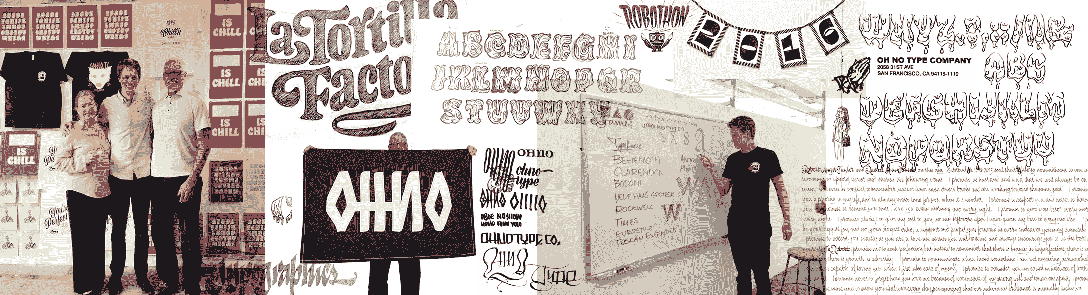
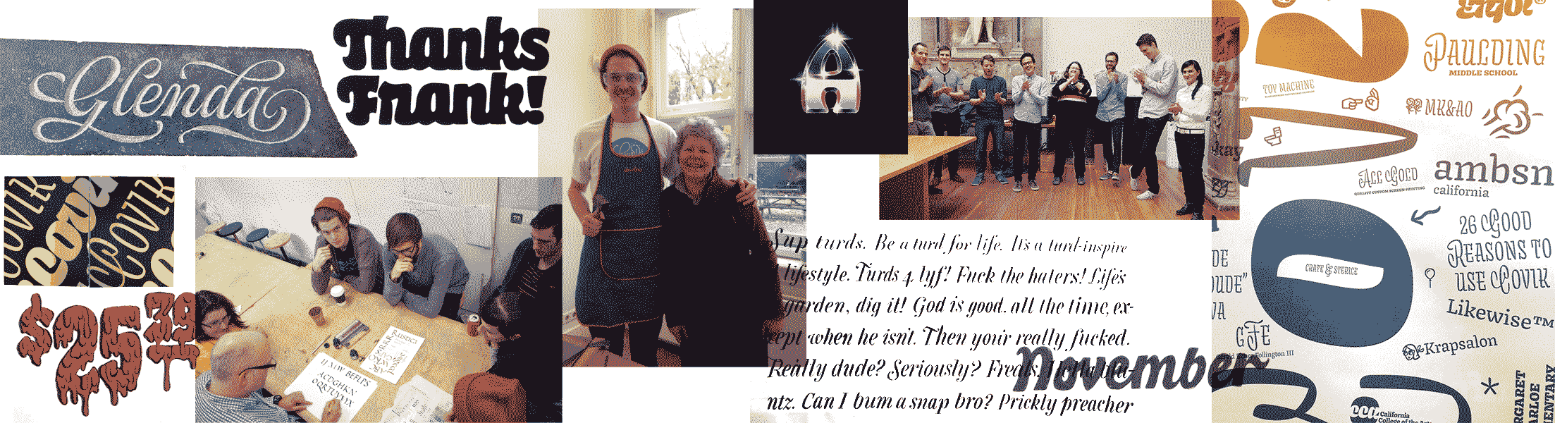
Ohno launched on August 24th, 2015. We printed posters, made shirts, and threw a party at The Aesthetic Union. My dad sewed a flag, and even Jim Parkinson showed up. Frank Grießhammer and Nick Sherman sold merch, Sun Helen made me a birthday cake. It was outrageously fun, but then I had to confront an unfortunate reality: No one wanted to buy our fonts!
After the excitement of our launch wore off, I had to face the facts that our current library of Hobeaux, and Viktor Script (a collaboration with lettering artist, and friend, Erik Marinovich) wasn’t selling as much as I’d hoped. But I had a plan: to make the most absurd typeface ever drawn, so that people would just have to buy it. It was foolproof, and the resulting project was Hobeaux Rococeaux.
Shocker—no one bought it. It was back to square one.
2016
And back again. Over the next few years I kept making new typefaces that were providing immense amounts of creative satisfaction, while generating meager amounts of revenue. Yes, the foundry could sustain me in the $700/ month room I sublet, but could it sustain anyone else? In the most expensive place to live in California? For how long? We were putting a huge emphasis on creating interesting work that was often somewhat experimental. But was that business model actually working?
Things were getting more serious with my girlfriend Sadie, and I told her she’d make an amazing mom. She said, “Don’t say that unless you mean it.” I replied poetically and articulately, “Ok.”
Sadie got pregnant just as we were getting asked to leave our rent-controlled apartment. The building had changed owners, and in a classic SF chain of events, they wanted the current tenants gone. With the help of some lawyers, the Housing Rights Committee, and SF Tenants Union, we arrived at a settlement, and were gone. Sadie was 3 months pregnant, and we had a lot to figure out before the baby came.
Even though the gravity of our situation weighed on me heavily, I still found plenty of time to work on some truly esoteric typefaces. Cheee, Eckmannpsych, and Beastly were mostly drawn during that time. All my nervous energy was getting channeled into type design. It’s a coping mechanism that has done more for our business than anything else.
We found a charming two bedroom, put the settlement and loans from our family into our down payment, subsidized the mortgage with a roommate, and began the humbling experience of paying everyone back.
2018
Loretta came at the end of May, and I faced the reality that I was still treating Ohno like an unsuccessful art project. It was tremendously fun for me to work on the fonts, and we were gaining recognition as a source of interesting work, but the business was nowhere near a home run.
I met up with my good friend and mentor Marty Grasser. I was lamenting the sleeplessness and financial stress I was under, when Marty’s words of advice hit me like a ton of bricks. “You gotta come back to Earth!” “Marty, what are you talking about?” “Your type, dude, you gotta come back to Earth.” It took a while for his words to sink in, but then I finally thought I understood. I texted Marty a screenshot of Obviously, a new grotesque I had started working on. Marty was encouraging, but I knew I still hadn’t convinced him yet. I did eventually release Obviously, and it has turned out to be a decent seller for us, but things didn’t click until we made something even more regular.
2020
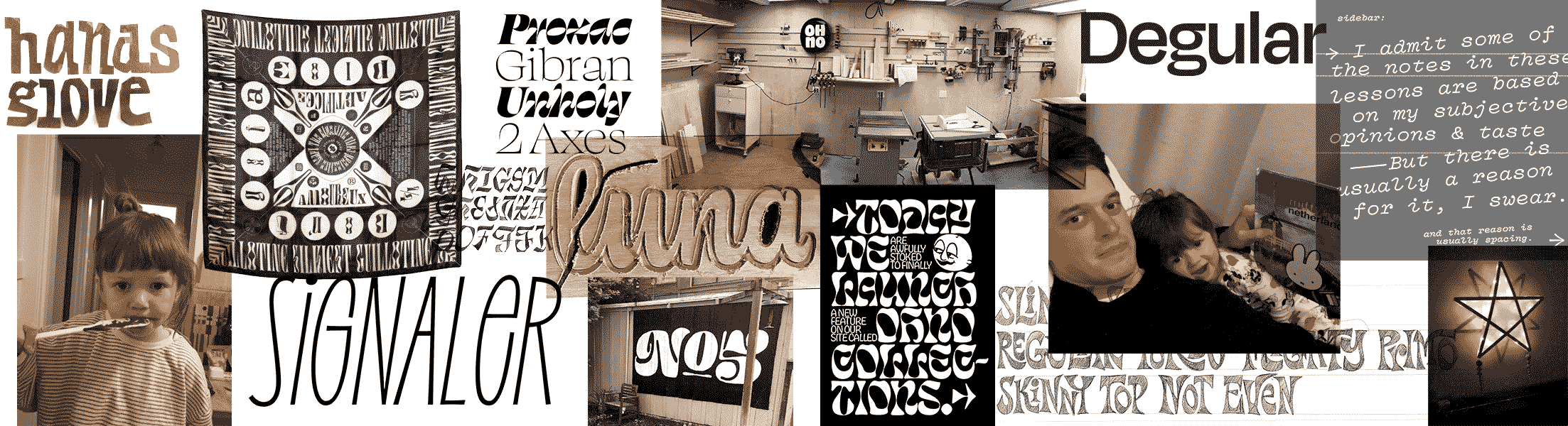
Degular came like a bolt of lightning to our library, and immediately the foundry became sustainable. We no longer needed to supplement our income with contract lettering work, and sales of all of our other typefaces picked up as well. Conceptually, it wasn’t the most impressive project, and I began to understand the difference between type for type users, and type for type designers! Through listening to Marty, I stumbled into something that actually sold. It was my 17th family for Ohno. Like my father says, “I might not be that good, but at least I’m a slow learner!”
The pandemic taught me everything I’m grateful for: a space to work from home, family living nearby, and a completely clear calendar. It reminded me so much of growing up. No extra curricular activities, and plenty of time. But it was also a time of seeing people in our community struggling massively in many ways. I began to meet with students once a week through Type Crit Crew, offering free critiques and listening to them about their struggles in design.
2021
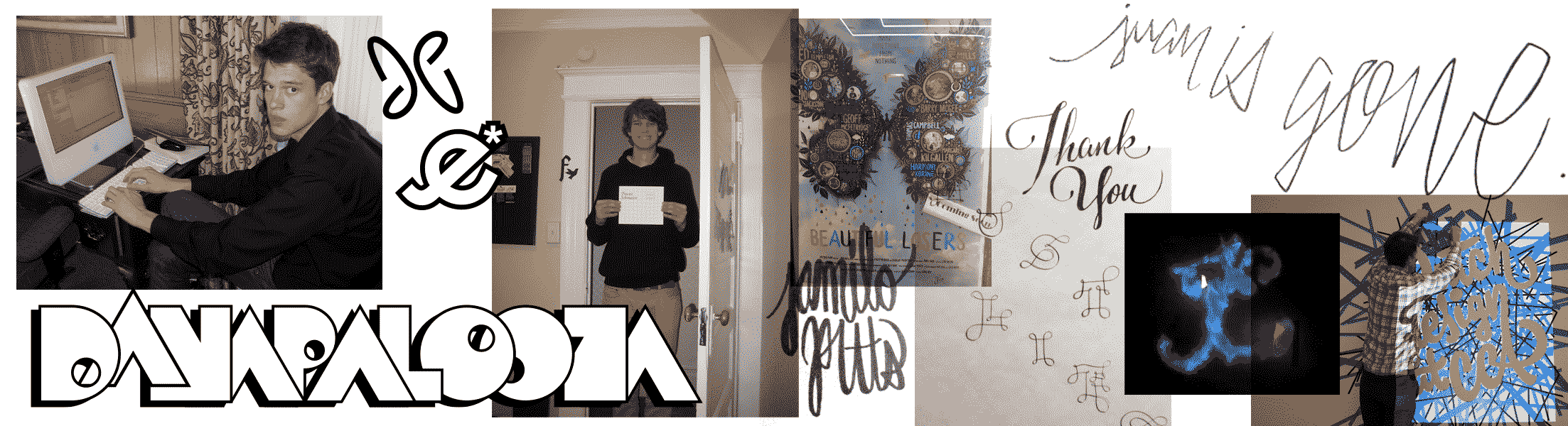
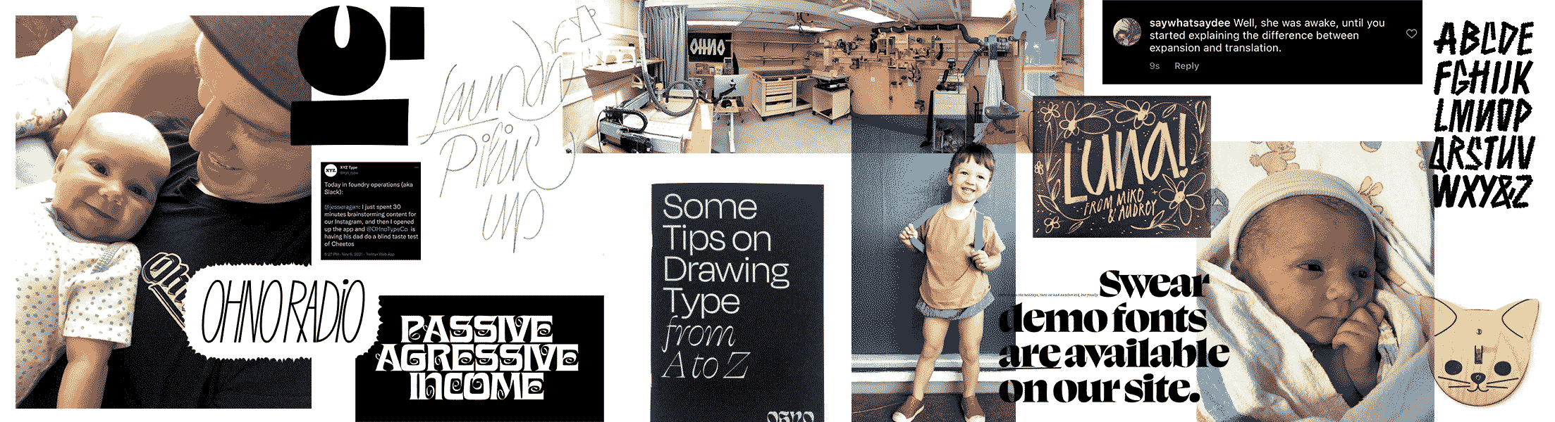
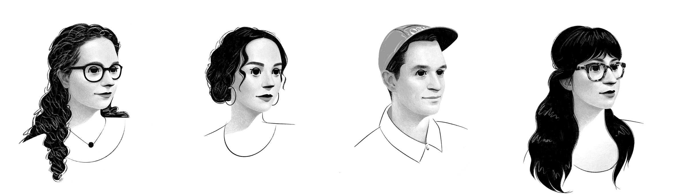
Our second girl PJ entered the world in February. Email fatigue was exacerbated by the lack of sleep, and I was losing enthusiasm quick. It had been 6 years of running the business alone, designing nearly all the type, responding to every customer support request and Instagram DM. I had shipped every merch item, written every thank you note, blog post, and typeface description. I threw my hands up, took another page out of Marty’s book, and posted a help wanted ad for a studio admin. The gods of typographic entrepreneurship sent me Jamie Otelsberg to handle customer service, and Lynn Barber to take on licensing correspondence. Releasing control over every aspect of the foundry was tough at first, but Jamie and Lynn quickly began taking a lot of work off my plate. In just a few months, I couldn’t believe how I ever lived without them.
Then I went on a family vacation, and was able to leave my computer at home. It was like a refrigerator turning off that you didn’t realize was on. Our customers were getting better service, and a ton of time was freeing up in my day. Jamie and Lynn turned out to be wonderful people that truly understood what I was trying to do with Ohno.
2022
One day I woke up with an idea that I wasn’t sure we could afford. Colin Ford was always on my radar as a “dang, it would be really great to hire someone like Colin” sort of person. But the fear of paying a salary, providing healthcare and a 401(k), and doing that every month indefinitely scared the life out of me. But I kept on coming back to the idea, and eventually reached out to Colin to see if that would be something he was even interested in. It was a good sign that he was wearing an Ohno shirt in the meeting, and a few months later after we figured out the paperwork and business filings, he started on June 1, 2022. It’s an awesome feeling to see our company grow, and gradually bring in more people that are kind, supportive, and care a lot about what we do. I can’t say I’m eager to take on more staff, but at the same time, I never would have expected we’d get to this point either.
That brings us to the present day, and we are still figuring out the balance between type that works, and type that inspires us. We have tried many many things that didn’t really work, and will definitely try some more. I’ll never be able to pay back all the people that helped me on this journey. That’s why I’m committed to making Ohno a positive force in the graphic and type design community. We talk to students, do lectures, occasional free critiques, and put out free educational content. In the future, we hope to strengthen all of those things, and one day create a maker space combining everything I love about crafts and typography. This is still just the beginning of Ohno, and I am so grateful to every single customer that has licensed fonts, followed us on instagram, subscribed to our newsletter, or just mentioned us to a friend, or just read this story. Without you, I might still be in Powerpoint.
Colophon
Huge thanks to everyone involved with this 👩🏼💻👨🏻💻website: August Miller, and Savannah Julian at Oof Studio. Our amazing staff 🏭 Jamie Otelsberg, Lynn Barber, Colin Ford, and Sadie. Our distributors 🛒 Future Fonts (Travis Kochel and Lizy Gershenzon 🖤), Adobe Fonts (Ari Remoundakis and Camille), and Fontstand. Friends 💞 Erik Marinovich, Kel Troughton, Tommi Sharp, Tad Wagner, Tânia Raposo, Frank Grießhammer, Nina Stössinger, Indra Kupferschmid, Graham Bradley, Rob Stenson, Jack Stratton, Christian Scwartz, Jeremy Mickel, Ken Barber. My old TypeMedia 📚 classmates: Mark Frömberg, Hugo Marucco, David Chmela, Sláva Jevčinová aka Slavie Slaverson, Mark De Winne, and Nina Stössinger. Tool makers and software developers: Ondrej Jób, David Jonathan Ross, Ben Kiel, Gustavo Ferreira, Frederik Berlaen, Loïc Sander, Tal Leming, Loïc Sander. My brothers Mark, Paul, Alex, Cameron, and Georgie. My old type design 🍎 instructors: Erik van Blokland, Paul van der Laan, Peter Biľak, Peter Verheul, Jan Willem Stas, Françoise Berserik, and Rod Cavazos. My old Graphic design and typography instructors, Mark Fox, Angie Wang, David Asari, Christopher Simmons, Bob Aufuldish, Brett MacFadden, Scott Thorpe, Tom Ingalls aka Backwards Man, Dennis Crowe, Michael Vanderbyl, Emily McVarish, Jon Sueda, and Eric Heiman. Personal heroes 🐐 Anderson .Paak, Joe Dart, Tyler the Creator, Jeff Tweedy, Jack White, Fred Armisen, Marie Kondo.